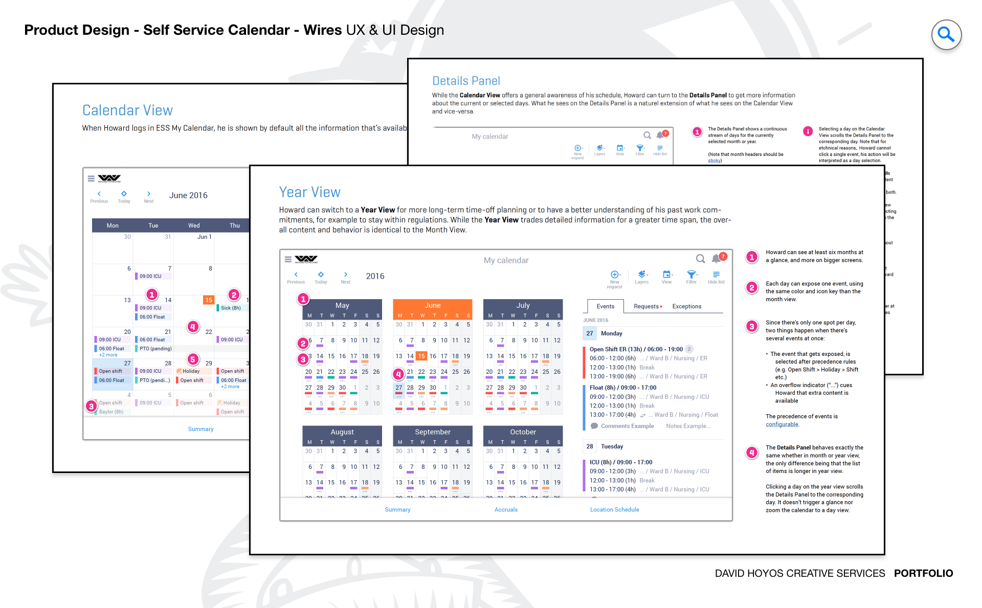
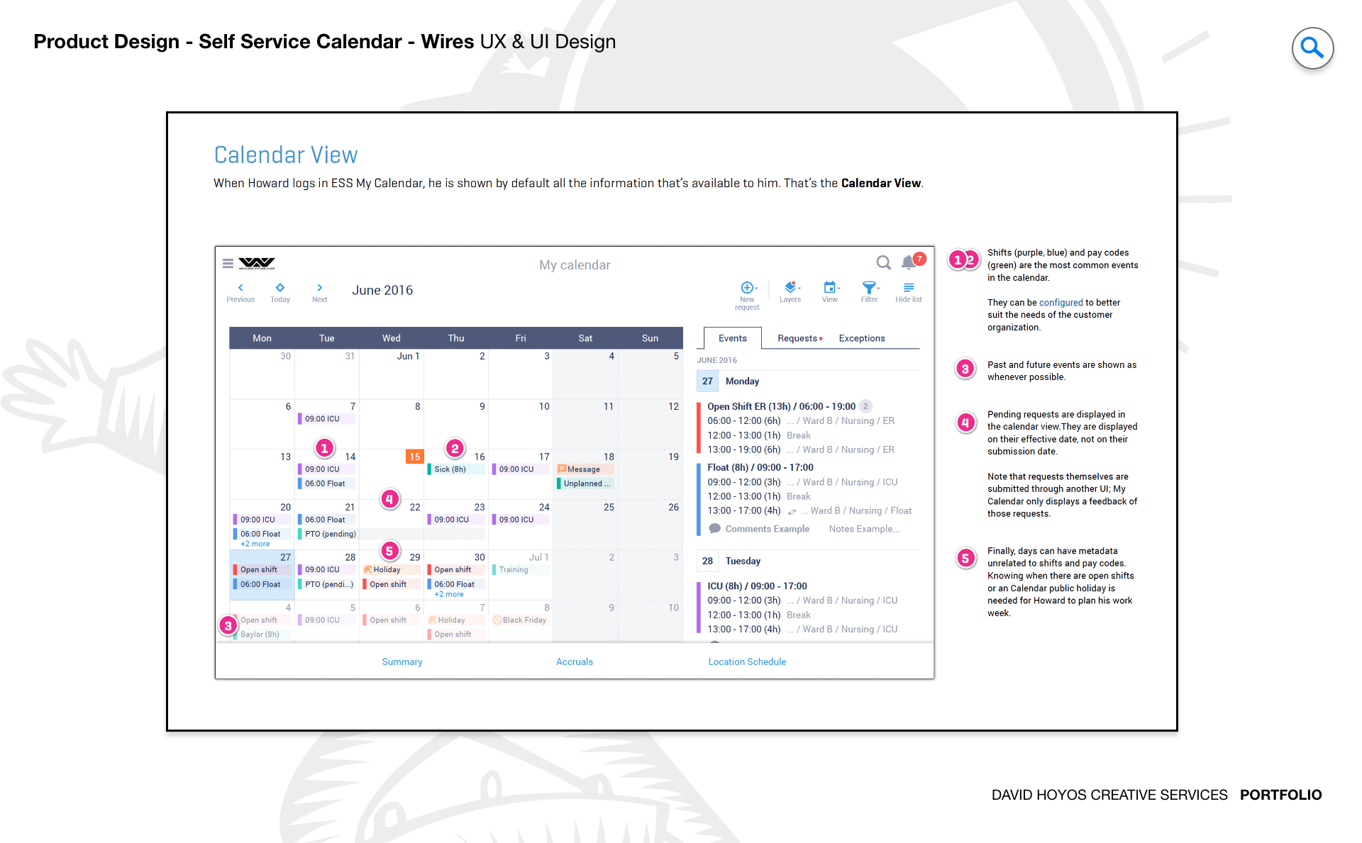
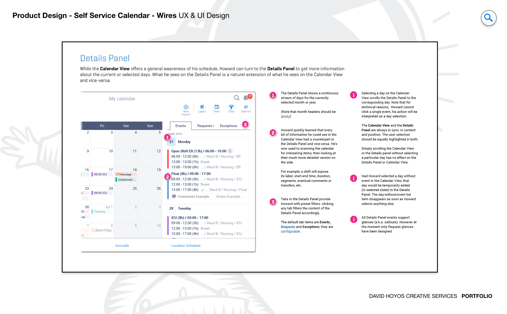
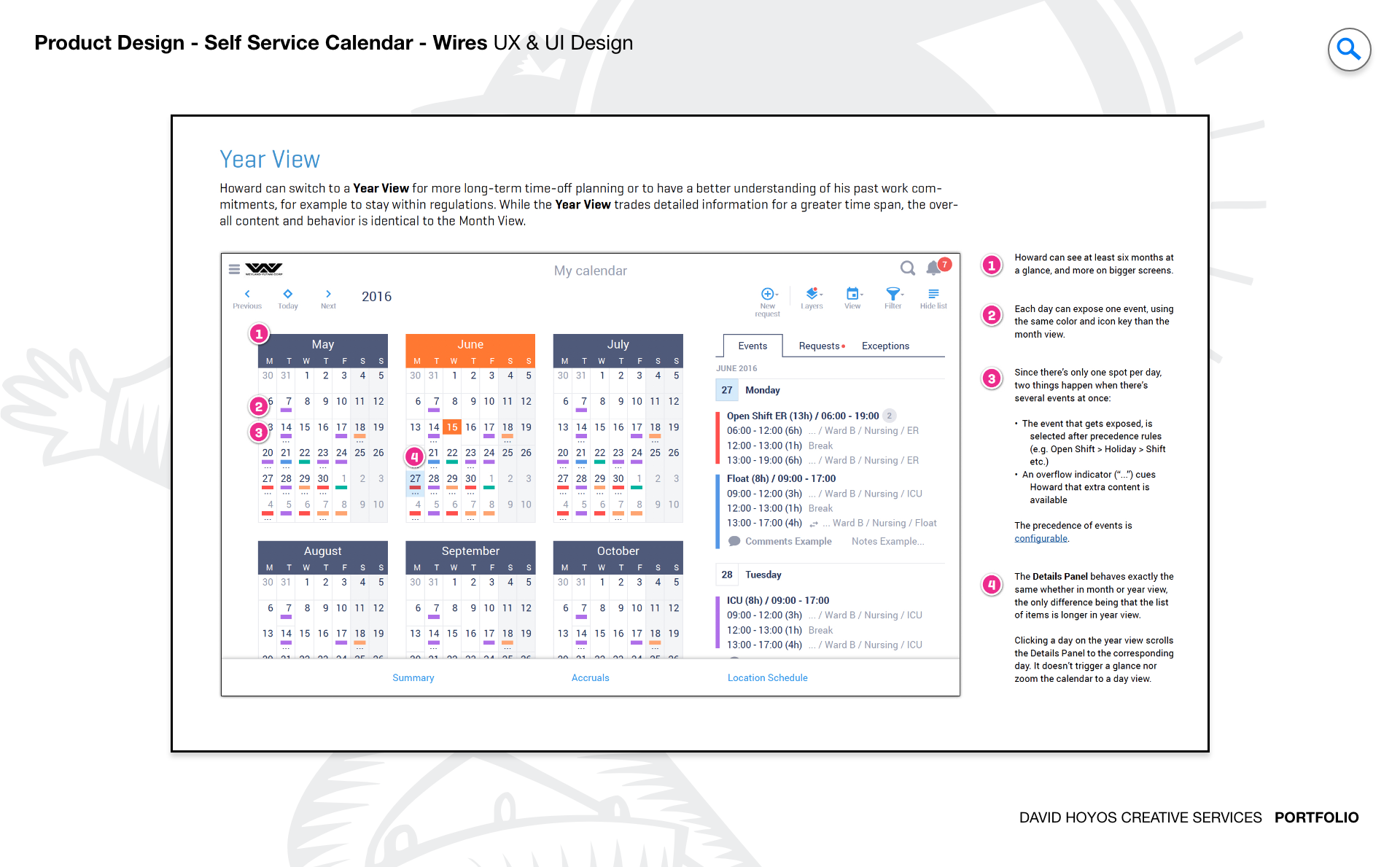
PROJECT Self Schedule Calendar A calendar is the interface through which every worker understands their relationship to the organization: when they work, when they are off, what is coming, and what might change. The Self Schedule Calendar project redesigned that interface for a new generation of mobile users, with a focus on responsive and adaptive views that made scheduling data not just accessible on a phone but genuinely useful in the conditions where employees and managers actually check it. This was not a feature addition to an existing calendar but a rethinking of the product from the mobile context outward. The next-generation framing carried real weight. The prior calendar had been built around desktop assumptions: static layouts, fixed dimensions, and interaction patterns that assumed a mouse and a wide screen. Designing the successor meant identifying which of those assumptions to carry forward, which to rewrite, and how to build a calendar that felt native on a small screen without losing the operational richness that made it valuable to the people who depended on it every day. OBJECTIVE The objective was to design and develop the next generation of the self-service calendar, with responsive and adaptive views that gave mobile users the same scheduling clarity that desktop users had always taken for granted. For employees, the calendar is one of the most accessed surfaces in the entire platform: they check it to know when they work, to request changes, to see who else is on their shift, and to understand the shape of their coming weeks. Making that access fast, readable, and actionable on a phone was not a UX refinement but a meaningful improvement in how the platform served the people who depended on it most. The adaptive dimension of the objective went further than responsive layout adjustments. Different mobile contexts call for different calendar views: a day view that shows everything about a single shift is the right format for an employee who needs to check in quickly; a week view that shows the shape of an upcoming stretch is the right format for a manager planning coverage. Designing the system to surface the right view in the right context, and to transition between views smoothly and intuitively, was where the next-generation ambition of the project was most visible in the finished product. CHALLENGE Data density, touch targets, vertical space. Data density on a calendar is a different problem than data density in a grid. A grid can paginate; a calendar cannot without losing the temporal context that makes it useful. A week view showing seven days of scheduling data for dozens of employees is trying to be both temporally comprehensive and informationally dense at the same time, on a screen that has a fixed number of pixels to work with. Deciding how much information each calendar cell should carry and how that information should be prioritized when space ran short was one of the central design decisions of the project. Touch targets on a calendar are particularly consequential because the interactive elements are the date cells themselves. A date cell that is tappable on a large tablet may be nearly impossible to select accurately on a small phone, especially in a week or month view where the cells are compressed to fit the screen. Designing touch targets that were reliable without disrupting the visual rhythm of the calendar required rethinking how density and interactivity were balanced in each view type, resolved through testing rather than estimation. Vertical space on a mobile calendar creates a specific tension: a day view that shows a complete schedule needs enough vertical room to be readable, but a week view that gives each day the same treatment becomes an endlessly scrolling column that loses the comparative value of seeing multiple days at once. Designing the adaptive logic that governed how much vertical space each view consumed under different conditions was iterative work that required testing with real scheduling data to validate before it could be specified with confidence. PERSONA(S) Manager, employee. Two personas, each using the calendar for a different purpose and arriving at it from a different operational context. Managers use the calendar as a coverage and planning tool. The view that matters most to a manager is the one that shows team-level scheduling across a meaningful time range: who is working, who is off, where the gaps are, and what adjustments might be needed before a shift starts. On mobile, that view had to be compact enough to render clearly on a phone without losing the comparative information that made it useful. A manager who can only see one day at a time cannot do coverage planning, and the design had to preserve the multi-day perspective even on the smallest screens. Employees use the calendar as a personal reference and self-service tool. Their primary questions are simple but time-sensitive: when do I work next, what shift am I scheduled for, has anything changed since I last checked. For employees, the calendar had to answer those questions as fast as possible with a minimum of navigation. The self-service capability extended to requesting schedule changes, swapping shifts, and managing availability, all of which had to be reachable from the calendar view without requiring the employee to leave the context they were already in. INDUSTRY Retail, manufacturing, healthcare, hospitality, sales & distribution, government. Six industries where the calendar is not an optional convenience but the primary operational artifact that structures how work gets done. In retail and hospitality, schedule volatility is the baseline condition. Shifts change, coverage needs shift with customer demand, and employees check the calendar frequently and often urgently. The mobile calendar had to be fast to load, easy to read at a glance, and built to surface changes clearly so that employees were never caught off guard by an update they had missed. In manufacturing and healthcare, the calendar often reflects compliance and certification requirements, and the design had to make that information visible to managers without requiring them to cross-reference a separate system. In sales and distribution and government, the workforces are geographically distributed and the employees are often working in environments where a desktop is simply not available. For these users, the mobile calendar was the primary means of staying connected to their schedule, and the design had to be reliable and readable under conditions that were often less than ideal: intermittent connectivity, bright outdoor light, and devices handled between tasks in an active work environment. The calendar had to hold up under all of it. PROCESS Assessment + Exploration + Design + Production + Deployment Assessment began by studying how the existing calendar was being used on mobile devices and where it was failing. Mobile sessions on the existing calendar were shorter than desktop sessions not because users found what they needed faster, but because the experience degraded quickly on small screens and users gave up. That distinction was important: a short session that ends in success is a good calendar; a short session that ends in abandonment is a design problem. The assessment identified the specific points where mobile users were losing context, encountering touch failures, or running into layouts that had not adapted correctly to their device. Exploration tested the range of possible view architectures: day, week, and month views with different approaches to information density, touch-target sizing, and adaptive behavior across screen sizes. The software architect's presence during this phase was essential because calendar rendering at scale involves real technical constraints: how many events can be rendered before performance degrades, how adaptive transitions are handled without jarring reflows, and how the system maintains context when a user switches between views. Design, Production, and Deployment completed the cycle by taking the validated design through to a fully specified, built, and released product. DELIVERABLES Wires, HIgh-Fidelities, BuildKit. Wireframes for a calendar system required working through the full matrix of view types and device sizes before any visual design decisions were made. A day view wire on a large tablet is a fundamentally different document than a week view wire on a small phone, and the interaction logic governing how a user moves between those states had to be specified in wire form before it could be built. The wire phase was also where the adaptive logic was pinned down: which view was the default on which device size, how view switching was triggered, and how the calendar always communicated the current view state to the user. High-fidelity designs translated the structural decisions into the full visual language of the product, with particular attention to how calendar-specific elements including event indicators, shift color coding, availability states, and selection highlights were rendered at mobile scale without losing legibility. The BuildKit delivered the complete implementation specification including component states, animation behaviors, breakpoint rules, and asset exports organized to give engineering everything needed to build the calendar exactly as designed. TEAM UX + UI + Research + Front-end Developer + Software Architect + PM UX, UI, Research, a Front-end Developer, a Software Architect, and Product Management. The software architect's involvement kept the design grounded in what the rendering layer could achieve at the performance levels the platform required. A calendar is a more constrained design space than many other enterprise components: the temporal structure is fixed, the interaction patterns are well-established across every platform, and users arrive with strong expectations about how a calendar should behave. Having engineering in the room during exploration meant that the design never chased directions that were technically impractical, and it gave the front-end developer the context needed to implement the adaptive behavior with the fidelity the design required. Research was particularly important on this project because calendar usability is easy to misjudge from inside the design process. The assumptions that feel obvious to a designer working in an ideal testing environment often break down when a real user is checking their schedule in a break room, in bad lighting, while doing something else at the same time. Research kept those conditions present throughout the design process and ensured that the decisions the team made were grounded in the actual contexts where the calendar would be used every day. ROLE Creative and design direction (UX/UI). Creative and design direction across UX and UI. The creative direction responsibility on this project was shaped by the next-generation framing of the objective: the work needed a clear point of view about what the self-service calendar should feel like at its best, one that was ambitious enough to represent a genuine improvement over the prior version but grounded enough in the product's existing design language to feel like an evolution rather than a replacement. At the design direction level, the role involved leading both the UX and UI work through all five process phases, from the early assessment through to the BuildKit that went to engineering. On a project where the full scope runs from discovery to deployment, maintaining design quality and design intent across that entire arc requires active direction at each phase, not just at the beginning. Decisions that seem settled during exploration have a way of drifting during production if the direction that established them is not present to hold them accountable to the original vision.