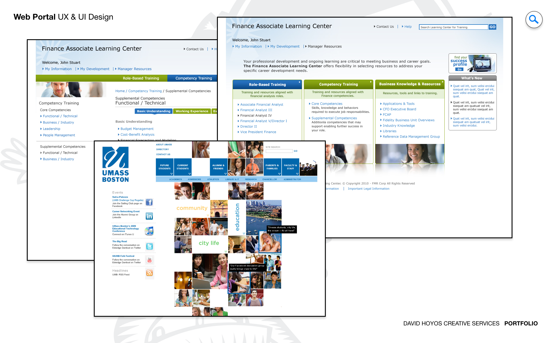
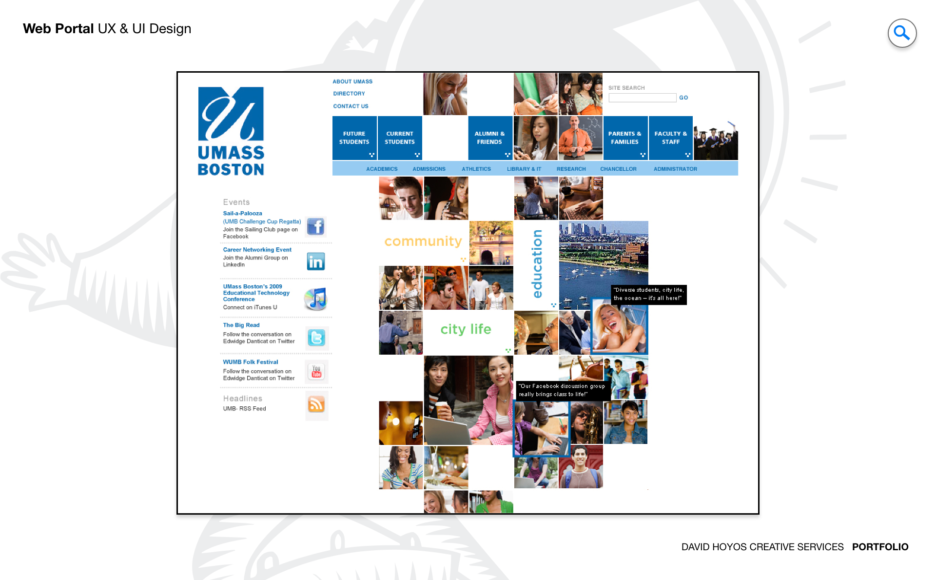
PROJECT Web Portals for Fidelity and UMASS Two web portal projects operating in distinct institutional contexts: the Fidelity Finance Associate Learning Center, an internal platform designed to centralize professional development resources for Fidelity's finance associates, and the University of Massachusetts website landing page, a public-facing digital gateway designed to represent the institution compellingly to its full breadth of visitors and direct them efficiently toward their goals. The pairing of these two projects under a single engagement reflects a design truth that cuts across industry boundaries: the challenge of building a portal that serves a defined audience well is structurally similar whether the audience is a cohort of finance professionals inside a major institution or the heterogeneous public audience of a major university. Both require a clear information architecture, a visual language appropriate to the institution's identity, and a user experience precise enough to get the right person to the right content with minimal friction. The design approach on both projects drew on those shared principles while responding to the specific character of each organization and the specific needs of the people it was built to serve. Fidelity and the University of Massachusetts are each institutions with significant brand equity and exacting standards for the digital experiences that represent them. Designing portals for organizations of that standing required not just strong UX fundamentals but a genuine understanding of what each institution valued, how it communicated its identity, and what success looked like for the specific audience the portal was built to serve. OBJECTIVE For the Fidelity Finance Associate Learning Center, the objective was to design an internal portal that consolidated the professional development resources, training materials, and learning pathways available to finance associates into a single, coherent, easy-to-navigate platform. Fidelity's associates operate in a high-stakes, knowledge-intensive environment where staying current with regulatory changes, financial products, and professional skills is not optional. The portal needed to make that ongoing learning as accessible and efficient as possible, reducing the time associates spent finding the resources they needed so they could spend more time engaging with them. The learning center also carried an organizational objective beyond individual productivity. A well-designed internal learning platform signals to employees that the organization takes their development seriously and has invested in making it easy. That signal has real effects on engagement and retention in a competitive talent environment like financial services. The design needed to deliver on that signal at the level of experience quality, not just feature completeness: a portal that was functional but frustrating would undermine the message the platform was intended to send, while one that was genuinely intuitive and well-crafted reinforced it. For the UMASS landing page, the objective was to design a digital front door that captured the university's scale, ambition, and identity in a single compelling experience, while routing the highly varied visitor population, prospective students, current students, families, faculty, staff, researchers, and community members, toward the distinct destinations and information each group needed. A university landing page that tries to serve everyone equally ends up serving no one well. The design had to establish a clear visual and communicative hierarchy that honored the institution's brand while making the path forward immediately legible to every visitor type, regardless of how different their purpose for being on the site was. CHALLENGE The Fidelity Finance Associate Learning Center presented the information architecture challenge that all large internal learning portals share: the content library was vast, the user population had diverse roles and learning needs within the broader finance associate category, and the existing state of the content was not organized in ways that mapped cleanly to how associates actually thought about their development needs. Building a portal architecture that felt intuitive to a user who had not designed it required understanding not just what content existed but how associates conceptualized their own learning, what questions they were trying to answer when they came to the portal, and how those mental models could be reflected in the navigation structure without requiring associates to learn a new organizational logic before they could find anything. The UMASS landing page challenge was the opposite problem in some respects: not too much to organize but too much to say. A major research university is an enormously complex institution, and every stakeholder group within it has legitimate reasons to want the landing page to foreground the things that matter most to them. Managing that competing-priorities problem at the landing page level, where a visitor arrives without prior knowledge of the site structure and makes a rapid judgment about whether the institution has what they are looking for, required design decisions that were simultaneously inclusive enough to acknowledge the full breadth of the university's audience and focused enough to avoid the visual and informational clutter that makes a landing page feel like an institutional directory rather than a compelling first impression. Across both projects, meeting the design standards of institutions with strong brand identities and established visual languages required the design work to be simultaneously original and faithful. Fidelity's visual identity and UMASS's brand system each had specific constraints around color, typography, and imagery that the portal designs had to operate within. Those constraints were not limitations to work around but parameters to design within intelligently, producing experiences that felt native to each institution's identity while achieving the UX quality that the portal's functional requirements demanded. The design's originality came from how it applied those brand systems to the specific information architecture and interaction challenges of each portal, not from departing from them. PERSONA(S) Finance Associate at Fidelity: a professional persona defined by continuous learning pressure and limited time. Finance associates operate in a regulatory and product landscape that changes constantly, and their professional development is not a periodic event but an ongoing responsibility. The portal they used to support that development needed to respect the value of their time above all else. An associate who could not find a resource quickly would either move on without it or use a different, less efficient path to get it. The design had to make finding the right content fast enough that the portal became the associate's default resource rather than a fallback option. UMASS visitor: a composite persona that encompassed a wider range of motivations, prior knowledge, and decision contexts than almost any other digital audience. A prospective student visiting the landing page for the first time was making an early-stage assessment of whether the institution warranted further investigation. A current student arriving to find a specific administrative resource needed to get there quickly without navigating content aimed at people who had not yet enrolled. A family member accompanying a prospective student had questions and priorities distinct from the student's own. A researcher or faculty member arriving for professional reasons expected a different point of entry than any of the above. The design's solution to serving that diversity was a clear visual hierarchy that established the institution's identity and primary value proposition at the top, with navigation structures that made the distinct paths for distinct visitor types immediately visible without cluttering the first impression with the full complexity of what lay beneath it. INDUSTRY Finance and Higher Education Finance is an industry where the quality of internal tools has a direct relationship with workforce performance. A finance associate who cannot efficiently access the training resources, regulatory updates, and product knowledge they need to do their job well is less effective at work that has real financial and compliance stakes. The internal learning portal was therefore not an employee benefit in the peripheral sense but a professional infrastructure investment, and the design had to meet the standard that implies: reliable, fast, organized with the precision that a knowledge-intensive profession demands, and visually appropriate to an institution whose public-facing brand communicates authority, trust, and precision. Higher education is a sector undergoing sustained pressure to demonstrate its value through the quality of every experience it delivers to prospective and current students, at a moment when the competition for student attention and enrollment is more intense than it has ever been. A university landing page is no longer a brochure digitized. It is the first moment of a relationship that the institution is trying to establish with a visitor who has other options and limited patience. Designing a landing page that converted first impressions into genuine engagement, for a university with the scale and institutional diversity of UMASS, required a design that was simultaneously authoritative enough to represent the institution's standing and accessible enough to make every visitor feel the site was built with them in mind. PROCESS Assessment + Exploration + Design + Production + Deployment Assessment on the Fidelity project began with an audit of the existing learning resource landscape: what content existed, how it was currently organized and accessed, where associates experienced the greatest friction in their current development workflows, and what the Information Architect identified as the primary structural problems in the existing content taxonomy. That audit produced a content inventory and a set of structural hypotheses about how the learning center's information architecture could be reorganized to match the mental models and task flows of the finance associate persona. On the UMASS project, assessment focused on the visitor population, the content hierarchy the landing page needed to establish, the competitive reference set of peer institution landing pages, and the brand constraints the university's visual identity imposed on the design direction. Exploration tested the structural and visual hypotheses on both projects before committing to high-fidelity execution. The navigation models, content groupings, and visual hierarchies developed during assessment were prototyped and evaluated against the target personas, producing a tested design direction for each project that Design, Production, and Deployment could build on with confidence. The five-phase process ensured that both portals arrived at launch grounded in real evidence about how their intended audiences navigated information, found resources, and formed impressions, rather than in assumptions about what a finance learning portal or a university landing page should look like based on category conventions. DELIVERABLES Wires, High-Fidelities, BuildKit (specs). Wireframes for both projects resolved the information architecture decisions that assessment and exploration had established into concrete layout structures: how content was grouped and sequenced in the Fidelity learning center's navigation, how the UMASS landing page's visual hierarchy distributed attention across the full range of visitor types, and how each portal's responsive behavior maintained the design's organizational logic across device sizes. The Information Architect's structural work from assessment was the foundation the wireframes were built on, ensuring the layouts reflected a tested understanding of how each audience navigated the content rather than an untested hypothesis about what a logical structure should look like. High-fidelity designs delivered the full visual expression of both portals within their respective brand systems: Fidelity's authoritative, precision-oriented visual language applied to a learning environment designed to feel organized and encouraging rather than austere, and UMASS's institutional brand applied to a landing page that balanced the complexity of the university's identity with the clarity a first-time visitor required. The BuildKit for each project provided complete implementation specifications, covering component libraries, responsive layout rules, interactive state documentation, and typography and color systems precise enough to give each development team an unambiguous reference for building the delivered design exactly as specified. TEAM UX + UI + Research + Front-end Developer + Information Architec + PM UX, UI, Research, a Front-end Developer, an Information Architect, and Product Management. The Information Architect's contribution was foundational to both projects in ways that reflected the specific design challenges each presented. On the Fidelity learning center, the IA work of restructuring the content taxonomy around the finance associate's actual learning mental models rather than the institution's internal content organization logic was the design decision that determined whether the portal would be genuinely useful or merely comprehensive. On the UMASS landing page, the IA work of establishing the visitor type hierarchy and the navigational logic that served each type without burdening others was the structural decision everything else built on. Research grounded both design directions in real user behavior: how finance associates currently found and used learning resources, where the UMASS visitor population's navigational priorities diverged from institutional assumptions about what visitors wanted to see first. The front-end developer's involvement during design kept both portals specified within the technical constraints of their respective implementation environments. Product Management maintained alignment between the design work and the institutional priorities of each client throughout, ensuring the Fidelity learning center advanced the organization's talent development objectives and the UMASS landing page served the university's enrollment and engagement goals at every design decision point across the full project arc. ROLE Design leadership and execution. Design leadership and execution across UX and UI for both portal projects. At the leadership level, the role required establishing a design vision for two very different institutional clients with distinct brand identities, distinct audiences, and distinct definitions of success, and holding those visions coherently across a full-cycle engagement on each project simultaneously. That meant setting the design principles that governed how brand fidelity, information architecture quality, and user experience performance were balanced on each project, and maintaining those principles as the consistent standard against which every design decision across both projects was evaluated. At the execution level, the role covered the wireframes, high-fidelity designs, and BuildKit specifications for both portals across their full feature scope: the learning center's content navigation architecture, search and filter systems, progress tracking interfaces, and resource display patterns, alongside the UMASS landing page's visual hierarchy, visitor-type navigation structure, content modules, and responsive layout system. Delivering that scope at the quality level that Fidelity and UMASS each required, while keeping the design work grounded in real evidence about how each institution's audience navigated information and formed impressions, was the execution challenge that defined the role across both projects from assessment through deployment.