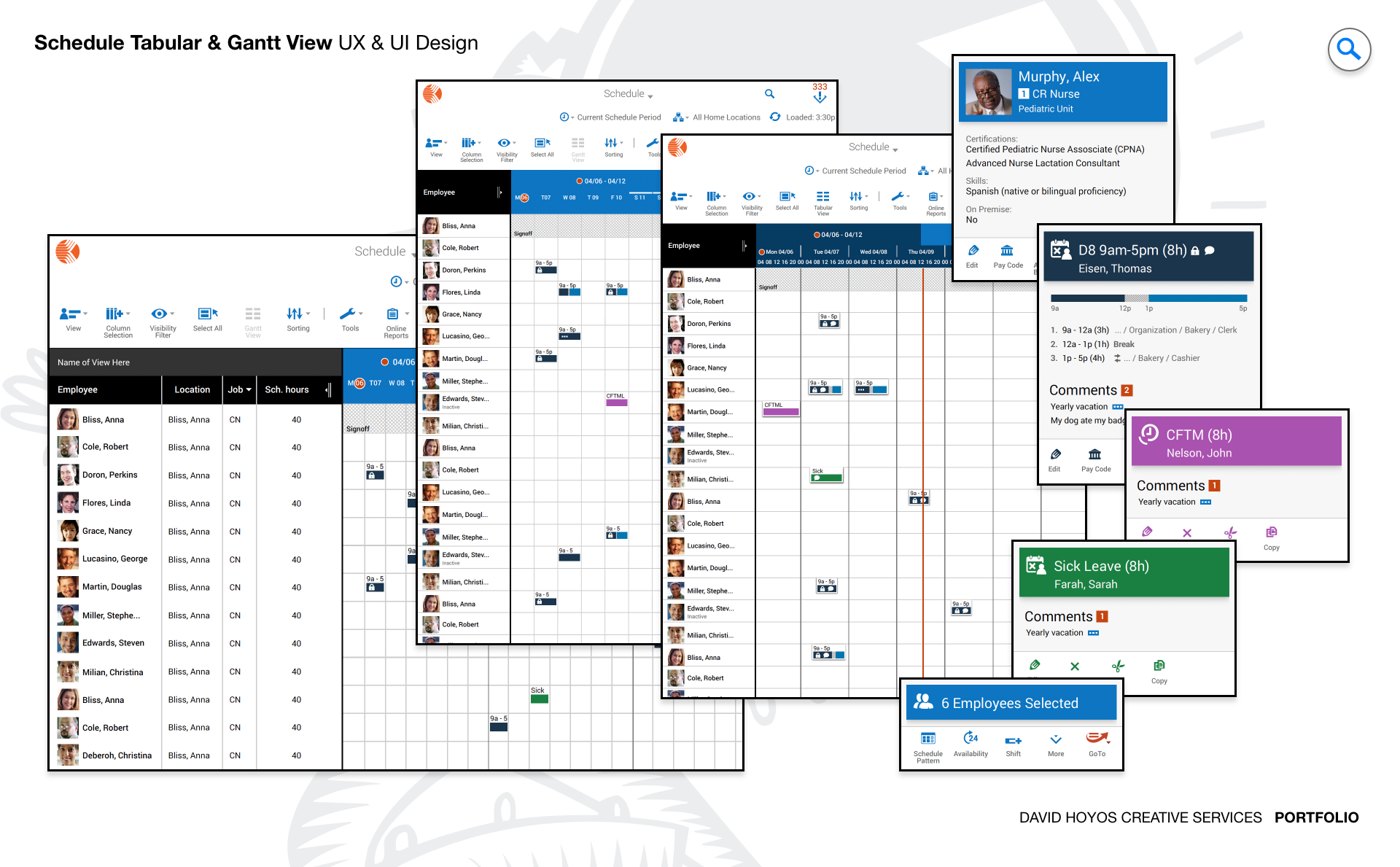
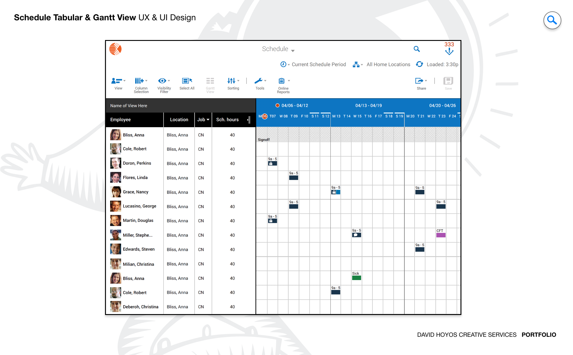
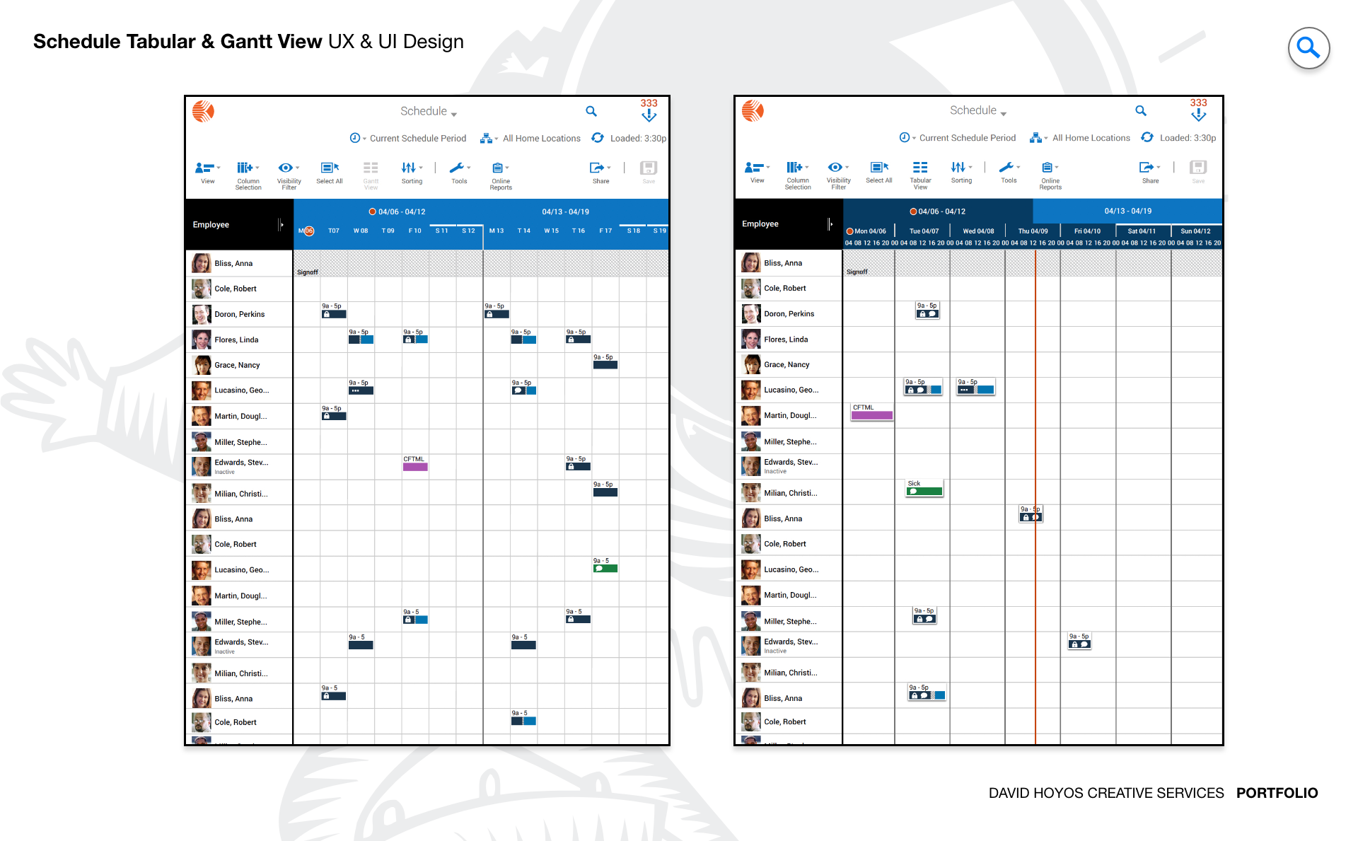
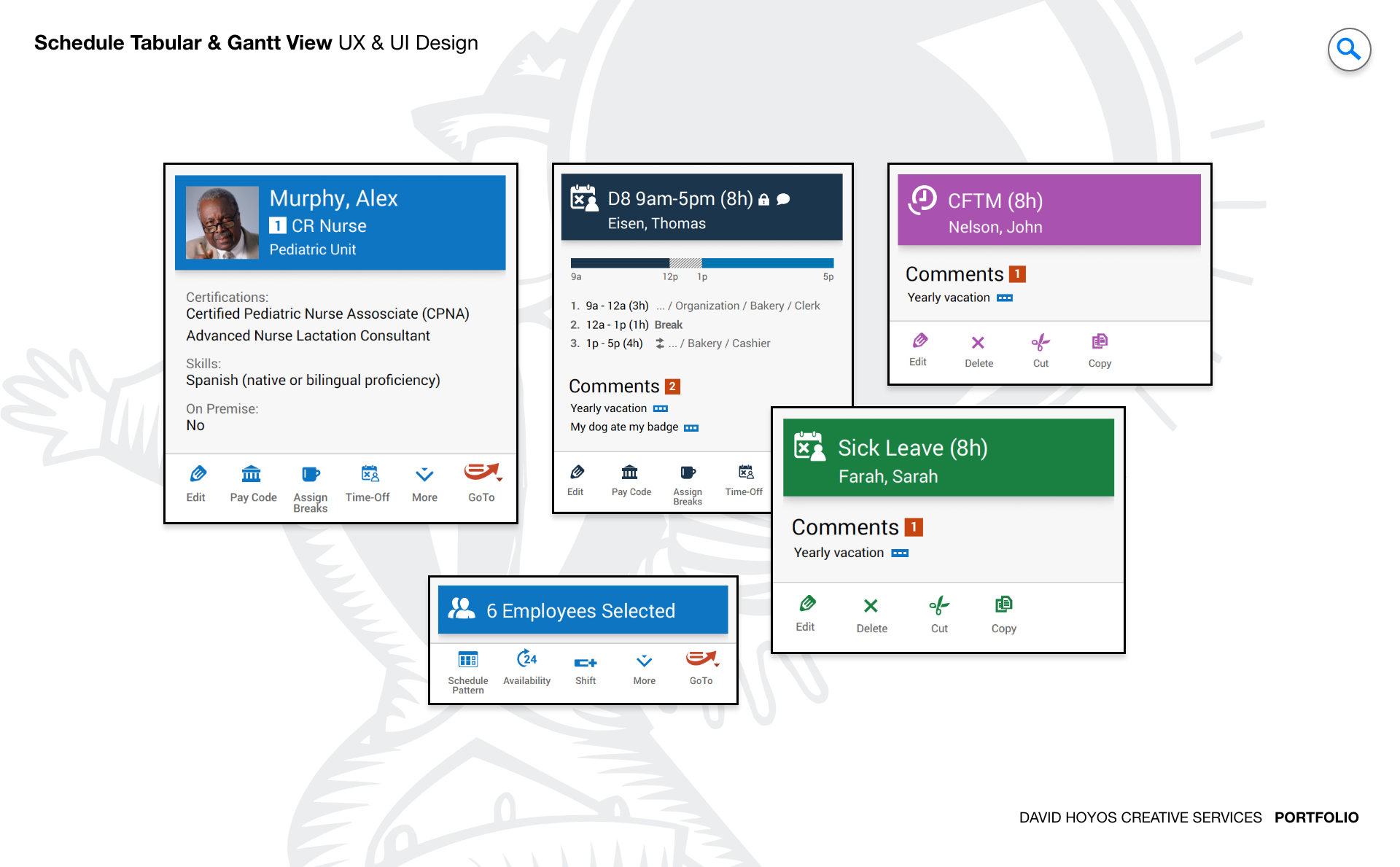
PROJECT Gantt View / Advanced Schedule. The Gantt chart is one of the oldest and most durable tools in project management. It works because it does something nothing else does as well: it makes time visible. At a glance, a manager can see where a project stands, what depends on what, where there is slack and where the schedule is tight. But traditional Gantt implementations carry the weight of their age. They were designed for desktop screens, mouse-driven interaction, and users who had time to learn a complex interface. The Advance Schedule product required a fundamental rethinking of what a Gantt view could be when the constraints of the original format were set aside and the needs of a modern, mobile-aware, accessibility-first enterprise audience were put at the center of the design problem. This was a next-generation redesign of an existing product, which meant the challenge was not just to build something better but to build something better that existing users could recognize and trust. The core functionality and familiar capabilities that made the previous version valuable had to survive the redesign intact. What changed was the depth, flexibility, and inclusivity of the experience around that core: responsive layouts that worked across every device, accessibility compliance that met AA standards throughout, new interaction capabilities that reduced friction for the most common workflows, and a visual language modern and cohesive enough to meet the expectations of enterprise users who had raised their standards alongside the broader software landscape. OBJECTIVE The objective was to design a next-generation Gantt view that elevated the Advance Schedule product to the standard that enterprise scheduling users now expect: a comprehensive, interactive, and genuinely accessible visualization tool that worked as well on a tablet or laptop as it did on a wide desktop monitor. The design needed to give managers the full power of Gantt visualization without the complexity overhead that had historically made that power expensive to access. Every additional capability introduced in this version was measured against the question of whether it made the manager's job easier or added to the cognitive load they were already managing. Responsive and adaptive layouts were a non-negotiable objective, not a nice-to-have. The Advance Schedule product served users across retail floors, hospital departments, manufacturing facilities, government offices, and hospitality operations, and those users worked from a wide range of devices in a wide range of physical contexts. A scheduling tool that only worked well when a user was seated at a full-size monitor was a tool that failed a significant portion of its audience. The redesign set out to make the Gantt view fully functional and genuinely useful across the device spectrum, with layouts that adapted intelligently to each form factor rather than simply shrinking or hiding content to fit. Accessibility at the AA standard was an objective with both ethical and practical dimensions. Enterprise software deployed across healthcare and government in particular operates in environments where accessibility compliance is not optional. Beyond compliance, the design team recognized that accessibility features benefit all users: keyboard navigation supports power users who prefer to keep their hands on the keyboard, high color contrast improves legibility in bright or challenging lighting conditions, and clear visual hierarchies reduce cognitive load for everyone, not just users with specific access needs. The AA standard was treated as a floor, not a ceiling. CHALLENGE Screen real-state (form factor), accessibility, touch targets, information overload.. Screen real estate was the defining constraint of the Gantt view design. A Gantt chart is inherently a wide-format data visualization: it needs horizontal space to display meaningful timelines, and it needs vertical space to display meaningful numbers of tasks. Both of those requirements are in direct tension with the realities of responsive design, where available screen width is not a given and where the same interface must function at widths that range from a smartphone to a wide monitor. The design challenge was not just to fit the Gantt view onto smaller screens but to determine what a Gantt view fundamentally needs to be at each screen size to remain useful, and to design the adaptive behavior that transitions between those states gracefully. Accessibility introduced a set of requirements that pushed against the visual density that makes Gantt charts valuable. Touch targets at AA-compliant sizes require physical space on screen. Color contrast requirements constrain the visual differentiation strategies that dense data visualizations rely on to communicate status, type, and priority at a glance. Screen reader compatibility requires semantic structure underneath the visual interface that must be planned from the beginning of the design process rather than added after the visual design is complete. Each of these requirements was resolvable in isolation, but resolving them simultaneously, without sacrificing the information density that makes a Gantt view worth using, required design decisions that were carefully sequenced and mutually reinforcing rather than independently applied. Information overload was the third axis of the challenge, and in some ways the most persistent one. Enterprise project schedules are complex: they contain many tasks, many dependencies, many time scales, and many layers of status information, all of which a manager may need to access in the course of a single work session. A Gantt view that surfaces all of that information simultaneously overwhelms the manager it is meant to help. A Gantt view that hides too much of it forces constant navigation and breaks the at-a-glance comprehension that is the Gantt format's primary value. The design resolved this tension through a progressive disclosure model: the most critical information was always visible, secondary information was accessible through interactions that did not interrupt the primary view, and the customization tools gave managers control over exactly which information layers they needed for their specific context. PERSONA(S) Manager The manager is accountable for outcomes they do not fully control. They need to see the full picture of a schedule at a glance, identify where things are at risk before the risk becomes a problem, adjust quickly when circumstances change, and communicate status clearly to the people above and below them in the organization. The Gantt view was designed to make all of that easier, which meant understanding the specific ways it had been made harder by the limitations of the previous version. The manager persona across the five industries this product served shared the scheduling responsibility but differed significantly in context. A retail manager reviewing staffing coverage for the upcoming holiday period has different time horizons, different urgency signals, and different intervention options than a healthcare department head managing shift coverage for clinical staff or a manufacturing floor supervisor tracking production timeline against delivery commitments. The design had to be flexible enough to serve those different contexts without requiring each type of manager to configure the tool extensively before it became useful. The customization features, the adjustable time scales, and the column management capabilities were the design mechanisms that gave each manager the version of the Gantt view that matched their specific operational reality. INDUSTRY Retail, manufacturing, healthcare, government and hospitality. Five industries with meaningfully different scheduling cultures, compliance requirements, and operational rhythms, all served by the same product. Retail schedules around consumer demand, seasonal peaks, and staffing availability. Manufacturing schedules around production capacity, supply chain dependencies, and delivery commitments. Healthcare schedules around clinical coverage requirements, regulatory mandates, and patient care continuity. Government operations schedule around public service obligations, workforce regulations, and budget cycles. Hospitality schedules around event calendars, occupancy patterns, and service delivery standards. Designing a Gantt view that served the common scheduling logic across those five domains without oversimplifying any of them required a flexible system architecture that the design could express through a consistent visual language. The government and healthcare presence in the industry set made accessibility compliance a hard requirement rather than a design preference. Public-sector and clinical software procurement processes increasingly include accessibility audits as standard components of vendor evaluation, and products that do not meet AA standards are disqualified before they reach a purchase decision. The AA compliance designed into this Gantt view was therefore both the right thing to do for users with diverse abilities and a commercial prerequisite for the product to compete in two of its five target industries. That dual motivation ensured accessibility was treated as a first-class design requirement rather than a compliance checkbox addressed at the end of the project. PROCESS Assessment + Exploration + Design + Production + Deployment. Assessment began with a thorough audit of the existing Advance Schedule product: what the current Gantt view did well, where it created friction for the manager persona, how it failed on smaller form factors, and where its accessibility gaps were most acute. That audit produced a prioritized list of design problems grounded in real user evidence rather than assumptions about what managers needed. Assessment also established the technical parameters the Software Architect had defined, ensuring the design worked within the implementation constraints of the platform from the beginning rather than discovering those constraints late in the process. Exploration worked through the structural and interaction design challenges in wireframe before any visual decisions were made. How should the Gantt view adapt across breakpoints? How should the progressive disclosure model handle task detail at each device size? Where should the customization controls live relative to the primary view, and how should they behave on touch devices versus pointer devices? The answers to those questions shaped the Design phase, which built the full visual system on top of the tested structure: the cohesive color scheme, the typographic hierarchy, the iconography, and the component library that made the Gantt view feel modern, coherent, and unmistakably purpose-built. Production and Deployment completed the cycle, with the Software Architect's involvement ensuring the implemented product matched the designed specifications across every supported environment. DELIVERABLES Wires, High-Fidelities, BuildKit (specs). Wireframes resolved the structural decisions that the screen real estate and information overload challenges made critical: how the Gantt timeline and task list were proportioned and balanced at each breakpoint, how the column management and time scale controls were positioned and triggered, how drag-and-drop interactions were communicated and confirmed, and how the progressive disclosure model surfaced and concealed detail information without disrupting the primary view. Because the responsive behavior was a central design problem on this project, the wire phase included detailed documentation of adaptive layout transitions, not just static wireframes at fixed widths. High-fidelity designs delivered the full visual system for the redesigned Gantt view: a clean, modern interface language built on a cohesive color scheme optimized for both visual clarity and AA contrast compliance, a typographic hierarchy that made information density readable rather than overwhelming, and an iconography set consistent enough across the full application to function as a reliable visual vocabulary. The BuildKit provided the complete implementation specification, with particular depth on the accessibility requirements: the keyboard navigation model, the screen reader annotations, the color contrast ratios, the touch target specifications, and the responsive behavior rules, giving the development team everything they needed to build an AA-compliant product rather than an AA-aspiring one. TEAM UX + UI + Research + Front-end Developer + Software Architect + PM UX, UI, Research, a Front-end Developer, a Software Architect, and Product Management. The Software Architect's role on this project went beyond standard implementation oversight. The Gantt view's responsive behavior, its drag-and-drop interaction model, its real-time collaboration features, and its data import and export capabilities each carried architectural implications that shaped what the design could commit to. Having the Software Architect involved from the assessment phase meant those implications were understood before the design was built around them, preventing the costly late-stage revisions that happen when design and engineering operate in sequence rather than in parallel. Research connected the design decisions throughout the project to the real behavior and priorities of the manager persona across the five target industries, grounding the progressive disclosure model, the customization feature set, and the accessibility approach in observed evidence rather than assumption. The front-end developer's involvement during design ensured the responsive layout system and the touch interaction model were specified in ways the implementation could reproduce exactly. Product Management maintained alignment between the design work and the product roadmap throughout, ensuring the new Gantt view advanced the Advance Schedule product's competitive position in all five target industries while remaining faithful to the core workflow logic that existing users depended on. ROLE Creative and design direction (UX/UI). Creative and design direction across UX and UI for the full scope of the Gantt View redesign. At the creative direction level, the role required establishing the visual and interaction design vision for a complex enterprise data visualization product and holding that vision coherently across a project that touched screen real estate management, accessibility compliance, responsive layout systems, and a broad multi-industry audience simultaneously. That meant setting the design principles that governed how the Gantt view's many competing requirements were prioritized and resolved, and maintaining the clarity of that framework as the design moved from wireframes through high-fidelity execution. The design direction role on this project carried responsibility for the accessibility strategy, because accessibility decisions made early in a complex data visualization design have downstream consequences throughout the visual system. Establishing the color contrast standards, the touch target specifications, the keyboard navigation model, and the screen reader architecture as first-class design requirements rather than post-hoc additions shaped the visual and interaction design from the beginning in ways that ultimately produced a cleaner, more coherent product. Driving that perspective throughout the team's work, and defending its priority against the competing pressures of feature delivery timelines, was a defining dimension of the creative direction the role provided.