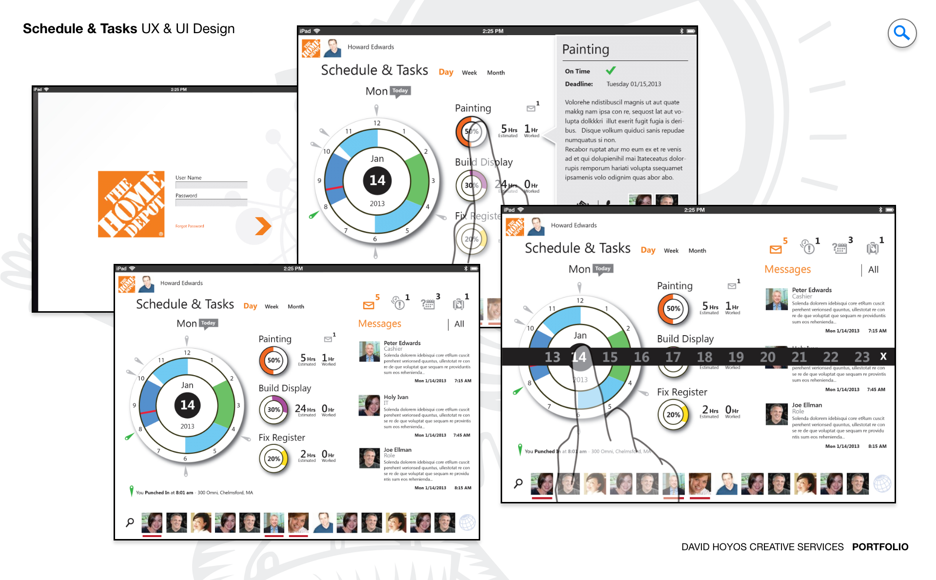
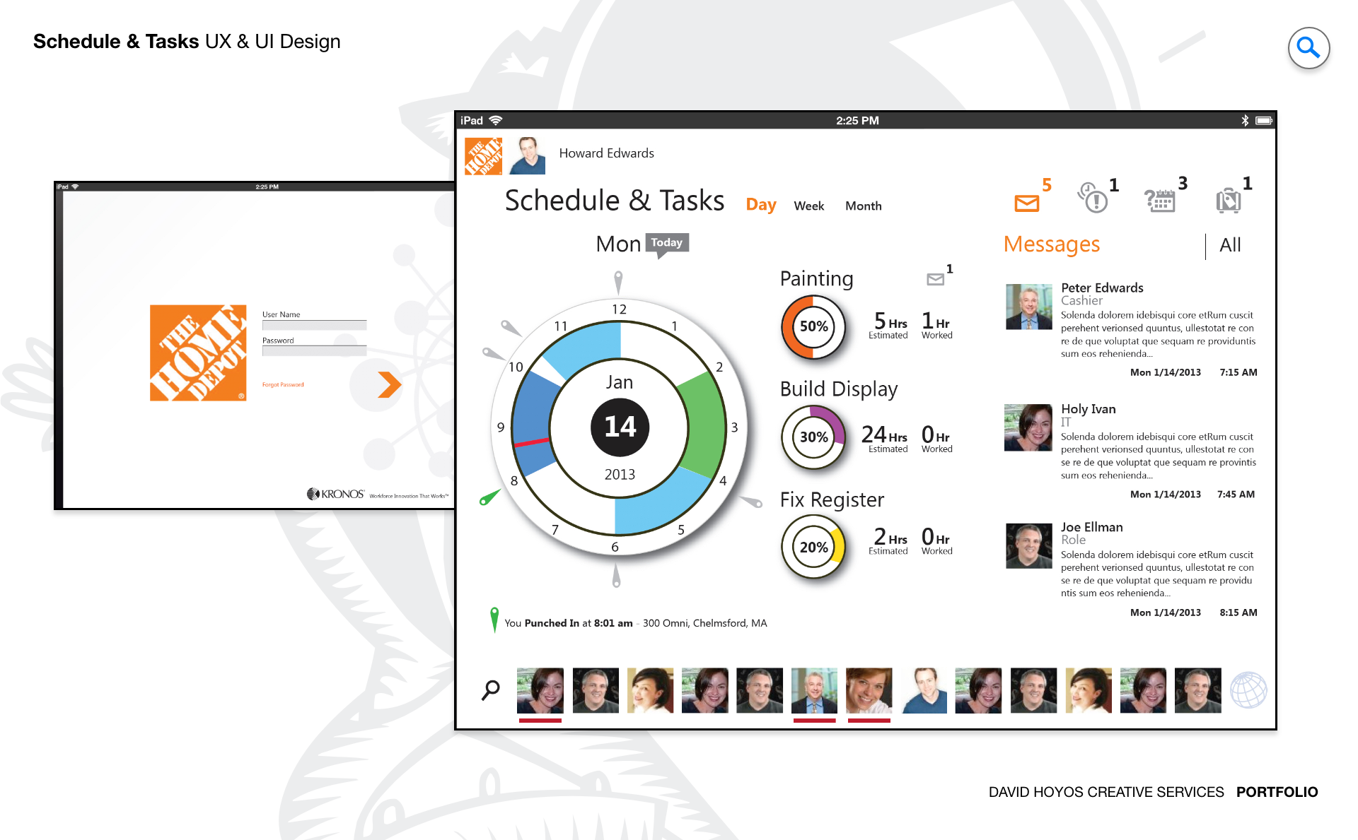
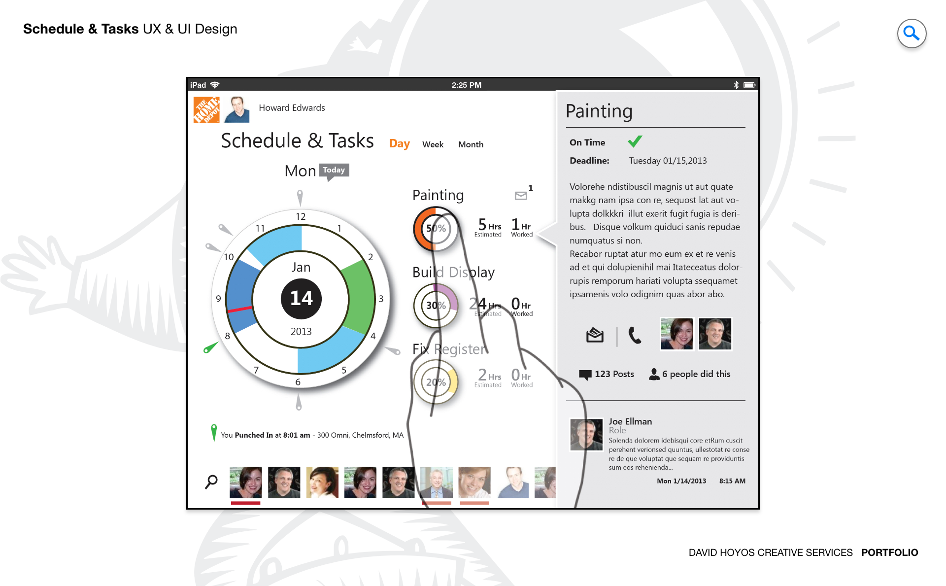
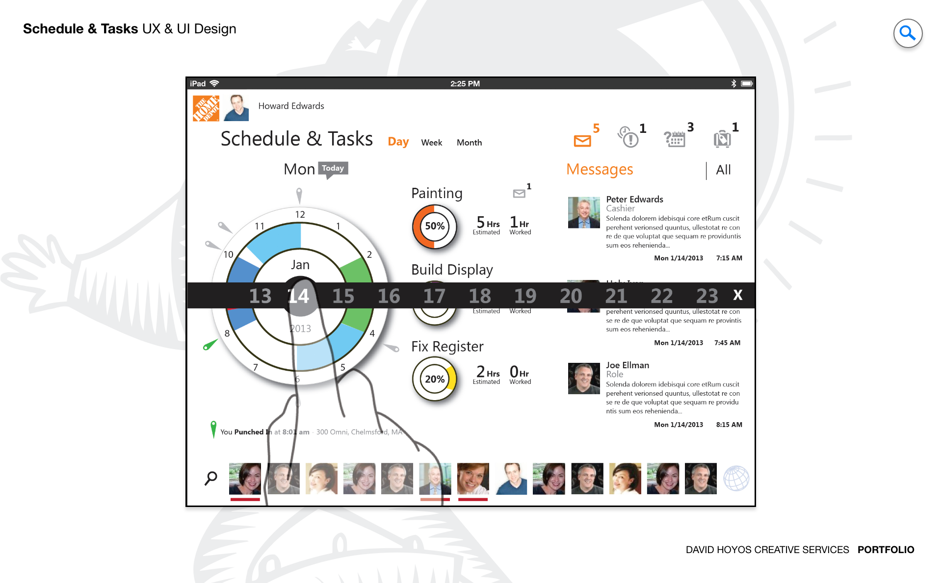
PROJECT Schedule & Tasks Tablet App. The tablet occupies a unique position in the device ecosystem: it has more screen real estate than a phone but a different interaction model than a desktop, and it is used in contexts that are neither fully mobile nor fully stationary. Designing a native iOS app specifically for the tablet form factor rather than adapting a phone app or scaling down a desktop product was the foundational decision that shaped everything that followed. The Schedule and Tasks app was built to take full advantage of what a tablet does well: the larger canvas for side-by-side views, the precision of touch interaction at a generous scale, and a posture of use that sits between the quick-check behavior of a phone and the sustained-work behavior of a desktop. The scope of the app — combining schedule management and task management in a single, unified product — reflected an insight about how managers and employees actually experienced their work days. Schedules and tasks are not separate organizational concerns; they are two expressions of the same underlying question: what needs to happen, and when. Designing an app that held both in a single coherent interface, rather than requiring users to switch between two separate tools, was the design premise that made the product more than the sum of its features. OBJECTIVE The objective was to design a native iOS tablet application that gave managers and employees seamless, unified management of their schedules and associated tasks in a single, well-designed environment. The app was built around the understanding that productivity tools succeed not because of the number of features they offer but because of how well those features work together. Schedule management and task management, when designed as an integrated system rather than two parallel modules, create a product where adding a task finds its place in the user's schedule, where scheduling a commitment surfaces the tasks needed to fulfill it, and where the user's full picture of what they are responsible for lives in one place. Beyond the core scheduling and task capabilities, the objective extended to a set of differentiating features that made the app more than a well-designed calendar: smart suggestions that identified optimal time slots and surfaced scheduling conflicts before they became problems, collaboration capabilities that allowed teams to share schedules and delegate tasks, a customizable interface that accommodated different productivity preferences, and a reminder system proactive enough to ensure that nothing in a user's schedule or task list slipped past unnoticed. Designing all those features to feel coherent rather than additive was as much of the objective as designing any individual one of them well. CHALLENGE Screen real-state (form factor), information overload and balance .Screen real estate on a tablet is a different design problem than on a phone, but it is still a constraint. A tablet screen is generous by mobile standards, but it is not unlimited, and an app that tries to display a schedule view, a task list, and smart insight panels simultaneously in a way that is usable and uncluttered has to make careful decisions about layout hierarchy and spatial priority. The tablet form factor created opportunities for side-by-side layouts and split views that were not available on a phone, but those opportunities had to be used deliberately rather than treated as a license to show everything at once. Information overload was the risk inherent in the app's ambition. A product that combines schedule management, task management, reminders, collaboration, and smart suggestions is a product with a large information surface, and every one of those features generates content that competes for the user's attention. The design challenge was ensuring that the app communicated what mattered most in any given moment without overwhelming the user with the full weight of everything it knew. That required a clear hierarchy of information priority and a careful approach to how the app's proactive features were surfaced without becoming intrusive. Balance between the schedule and task views, and between the proactive and passive dimensions of the app, was where the most iterative design work happened. A schedule view that dominated the interface made the task management feel secondary; a task list that crowded the schedule made the temporal dimension of the user's day harder to see. Finding the right visual weight and spatial relationship between the two primary views required testing with real users doing real planning work, rather than resolving it through aesthetic preference alone. PERSONA(S) Manager and employee. Two personas, each using the app to manage a different scope of responsibility and with different expectations about what the schedule and task views should prioritize. Managers use the app to coordinate their own responsibilities alongside their team's. The schedule view for a manager is not just a record of their own commitments but a tool for understanding how their time relates to what their team is doing: which meetings require preparation tasks, which coverage gaps need to be addressed before a shift, which deadlines are approaching and what still needs to happen to meet them. The smart suggestions feature was particularly valuable for managers, who typically had more scheduling complexity and more task interdependencies than individual contributors, and who could benefit most from an algorithmic view that surfaced conflicts and optimization opportunities they might not have seen on their own. Employees use the app more personally. Their schedule view centers on their own shifts and commitments, and their task list reflects the specific things they are responsible for completing during and around those shifts. For employees, the collaboration features had a different character than for managers: rather than delegating tasks outward, employees were receiving assigned tasks and coordinating with peers. The reminder system mattered most for this persona, ensuring that nothing in their schedule or task list was missed despite the fast-moving, often physical nature of their workday. INDUSTRY Retail, manufacturing, healthcare, government and hospitality. Five industries where the combination of schedule visibility and task management in a single tool addressed a real operational gap. In retail and hospitality, the pace of operations meant that managers and employees were managing schedules that changed frequently alongside task lists tied to those changes. A coverage shift that opened up created tasks that needed to be assigned; a special event on the schedule generated a preparation list that had to be tracked against a deadline. The integration between the two views was most immediately valuable in these industries because the relationship between schedule and task was most direct and most consequential for operational performance. In manufacturing and healthcare, the task management capabilities carried compliance dimensions: tasks tied to safety procedures, certification renewals, and equipment maintenance had due dates that the reminder system had to surface with appropriate urgency. In government, the collaboration and sharing features addressed the coordination challenges of distributed teams operating across multiple facilities or departments, where schedule visibility across a group was essential for planning. Across all five industries, the smart suggestions feature offered value that was proportional to the complexity of the user's schedule: the more commitments and tasks a user was managing, the more valuable an intelligent view of their day became. PROCESS Assessment + Exploration + Design + Production + Deployment. Assessment began by studying how managers and employees in the target industries were currently managing their schedules and tasks, and where the fragmentation between separate scheduling tools and task management tools was creating friction. The research revealed a consistent pattern: users were maintaining their schedule in one system and their task list in another, and the cognitive overhead of keeping those two pictures synchronized was a persistent source of missed items, duplicated effort, and planning errors. That finding defined the integration objective of the app more clearly than any design assumption could have. Exploration tested the range of possible layouts for combining schedule and task views on a tablet screen, the interaction model for the smart suggestions and conflict detection features, and the approach to collaboration that would make sharing and delegation feel natural rather than administrative. The software architect's involvement during exploration shaped the data synchronization architecture, ensuring that the seamless cross-device integration promised by the objective was technically achievable at the reliability level users would require. Design, Production, and Deployment completed the cycle, with iOS platform conventions informing the visual and interaction design throughout to ensure the app felt native rather than ported. DELIVERABLES Wires, High-Fidelities, BuildKit (specs). Wireframes for the Schedule and Tasks app had to resolve the spatial relationship between the schedule view and the task view across the tablet's available layouts before any visual design decisions were made. The wire phase was also where the smart suggestions interaction model was specified: how suggestions were surfaced within the schedule view, how users accepted or dismissed them, and how the conflict detection system communicated scheduling problems without interrupting the planning workflow. Those behavioral decisions were as important as the layout decisions and getting them right in wire form prevented them from becoming ambiguous during production. High-fidelity designs translated the structural decisions into a native iOS visual language that felt at home on the platform while reflecting the product suite's design identity. The customizable interface feature required designing a complete set of themes and layout variants, each of which had to be specified in the BuildKit alongside the default experience. The BuildKit delivered the full implementation specification including every view state, every smart suggestion behavior, every notification and reminder pattern, and every collaboration interaction, organized to give engineering a complete and unambiguous reference for building the app as designed. TEAM UX + UI + Research + Front-end Developer + Software Architect + PM UX, UI, Research, a Front-end Developer, a Software Architect, and Product Management. The software architect's involvement was particularly significant on this project because of the data synchronization requirement. An app that promises seamless synchronization across multiple devices is making a technical commitment that has to be validated during design exploration, not discovered during engineering. Having the architect in the room during the feature design phase meant that the synchronization behavior was specified with technical accuracy from the beginning, rather than being described aspirationally in the design and resolved pragmatically in engineering. Research kept the smart suggestions feature grounded in real user behavior. Algorithmic features are easy to design for an idealized user who receives suggestions at the right moment and acts on them exactly as intended. Real users encounter suggestions in the middle of other tasks, dismiss them without fully reading them, and develop preferences about what they want the system to surface. Research ensured that the suggestions feature was designed to be useful under those real conditions, not just the ideal ones, and those findings shaped the interaction model before it was committed to production. ROLE Design leadership and execution. Design leadership and execution across the full scope of the Schedule and Tasks app, from assessment through deployment. At the leadership level, that meant establishing the design vision for how schedule management and task management could be unified in a single product without either view feeling diminished by the other's presence. That was a spatial and conceptual design problem that required a clear point of view about how the two views related: not as separate tabs that happened to share an app, but as complementary perspectives on the same underlying picture of what a user was responsible for and when. At the execution level, the role covered the complete deliverable set across an app with a wide feature surface: the scheduling views, the task management system, the smart suggestions interaction model, the collaboration and sharing flows, the reminder and notification system, and the customizable interface variants. Each of those feature areas had its own design complexity, and maintaining quality and coherence across all of them simultaneously was the execution challenge that defined the role on this project. The BuildKit that went to engineering was the measure of how well that challenge was met. .