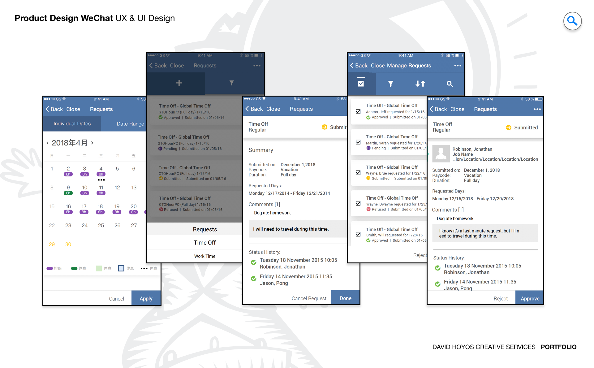
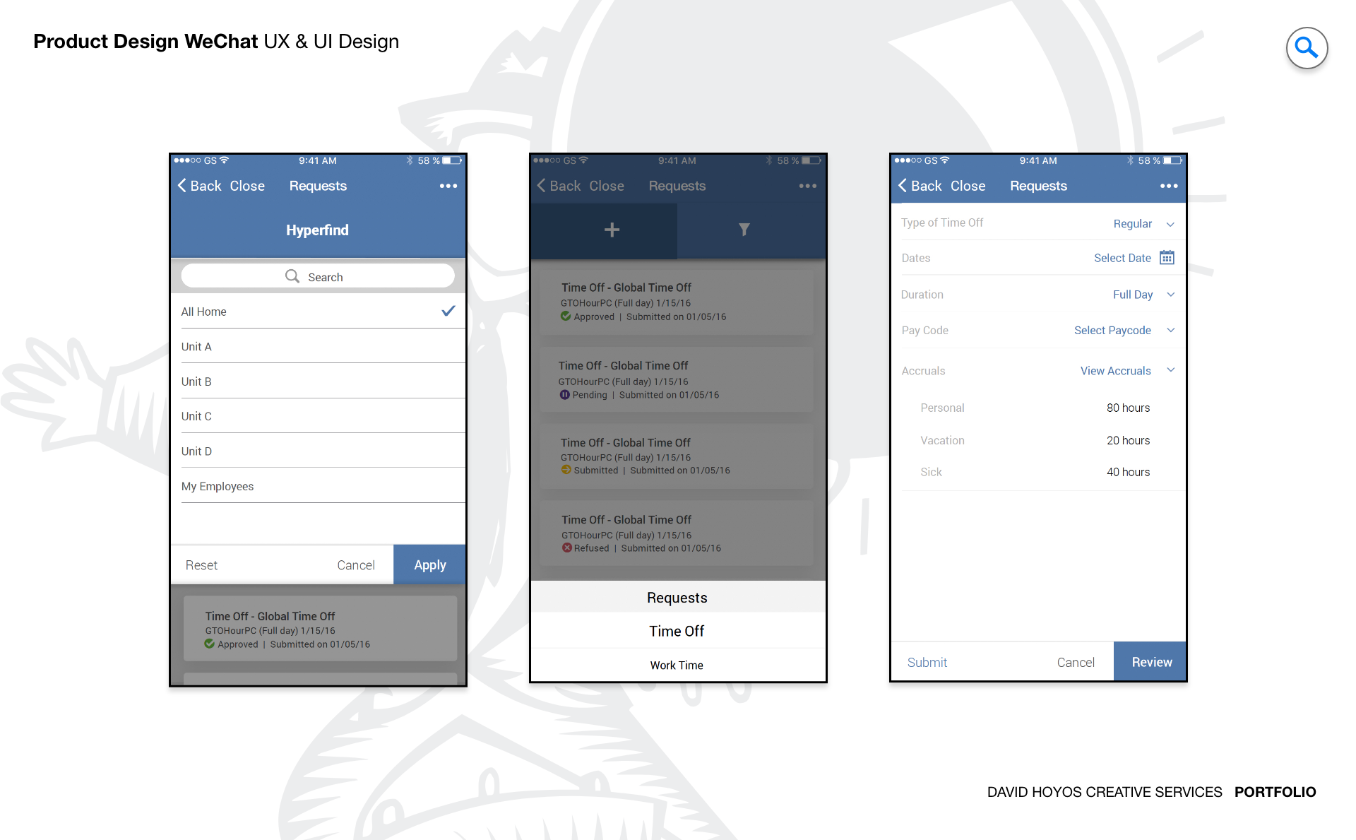
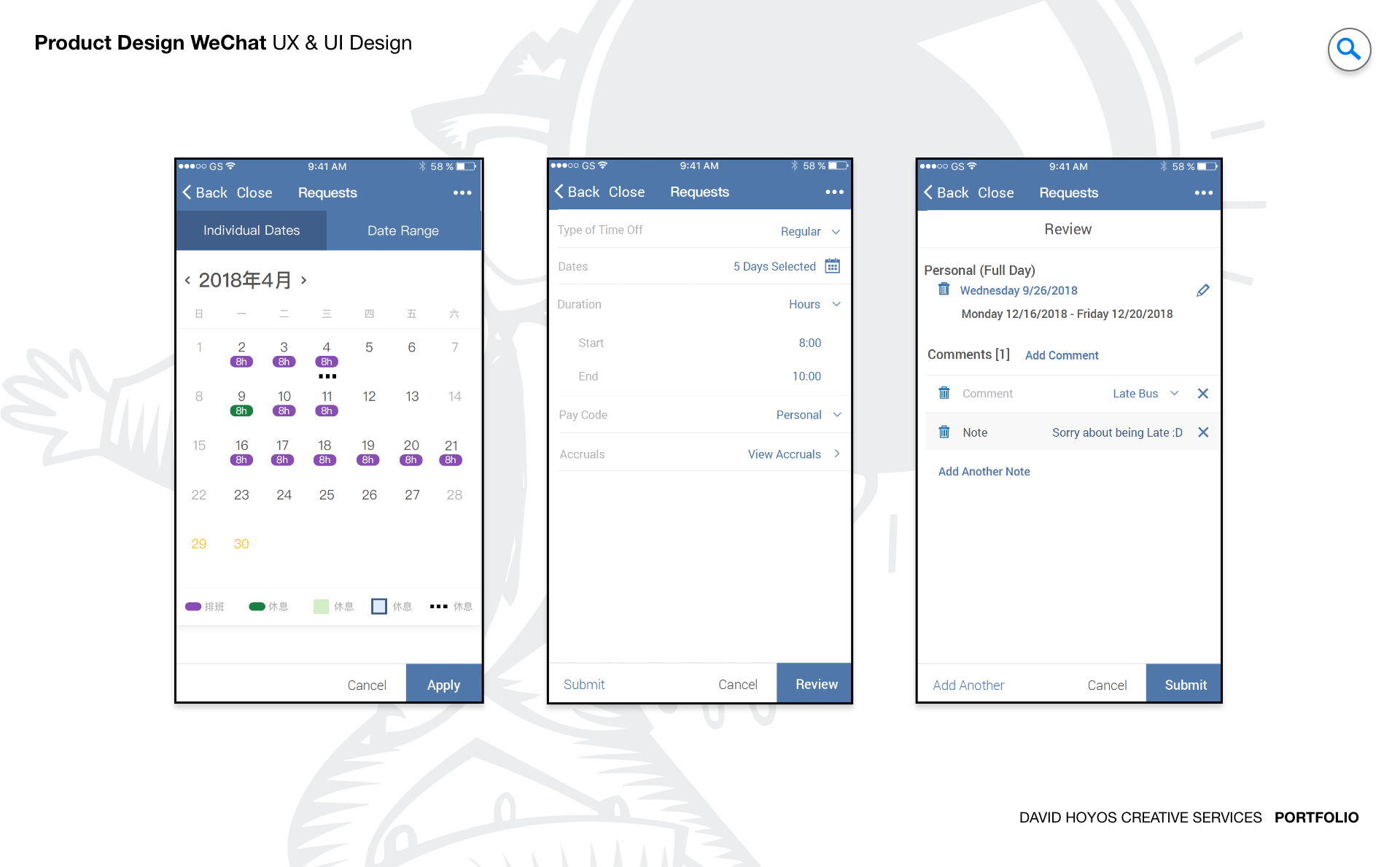
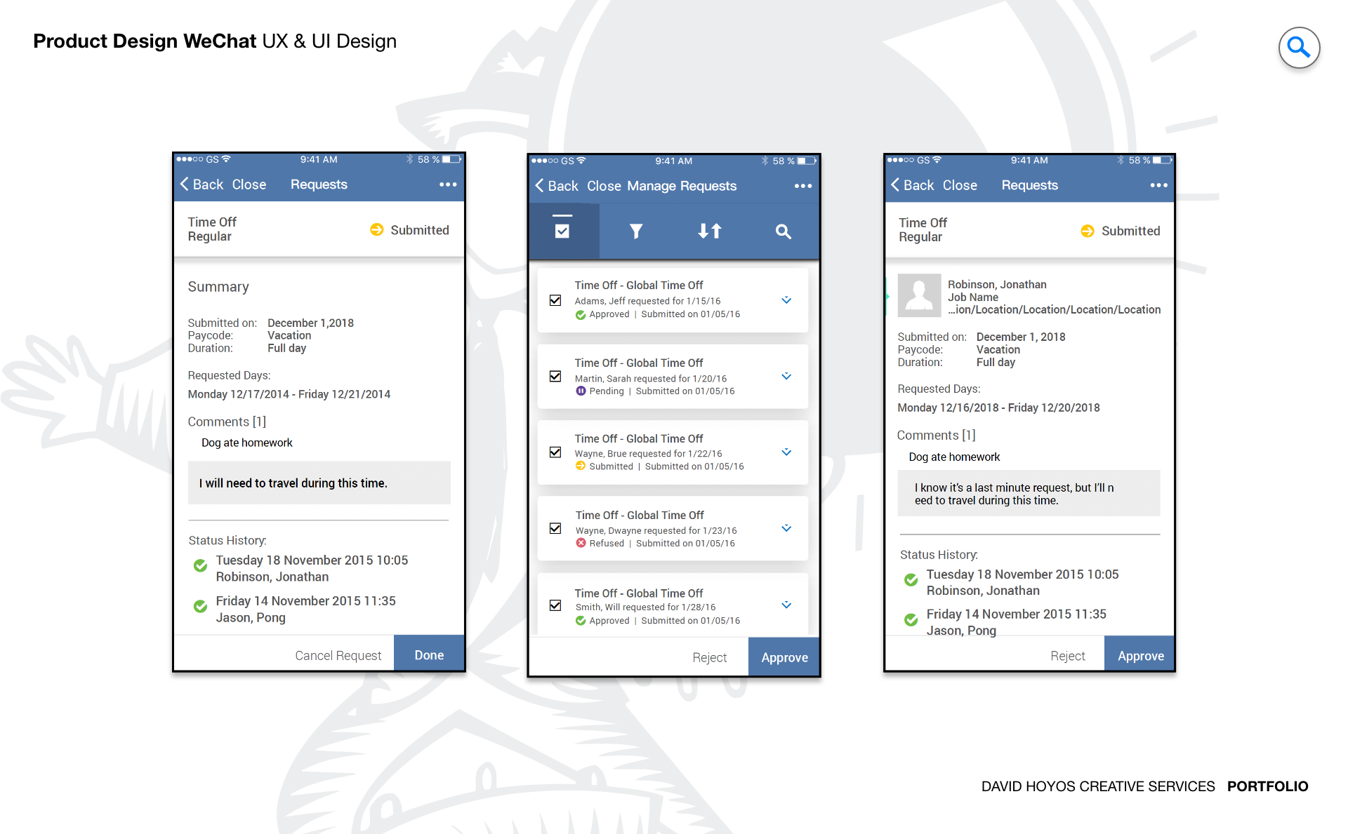
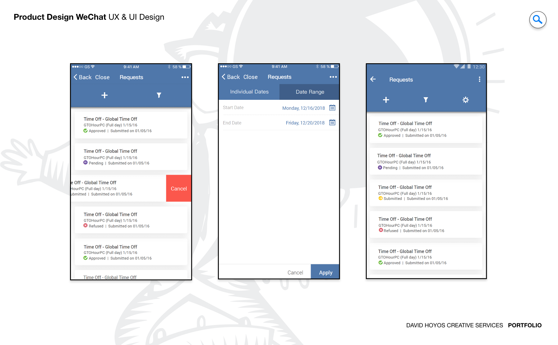
PROJECT WeChat Web App (Branded). WeChat is one of the most widely used communication platforms in the world, with a user base that has internalized its interaction patterns so deeply that the app's interface has become second nature to hundreds of millions of people. That familiarity is an asset when the goal is adoption: workers who already know how to navigate WeChat can use a WeChat-based enterprise tool on day one without a learning curve. The design challenge was to build on that foundation by rebranding the platform to carry the WFDimensions visual identity coherently, so the communication tool felt like a native extension of the workforce management suite rather than a consumer app operating independently within a professional context. Branded enterprise deployments of established consumer platforms are a distinct design discipline. The work is not about reinventing the product but about translating its identity, applying a new visual language with enough precision and consistency that users experience the product as belonging to the brand rather than merely wearing it. Done poorly, a brand overlay feels like a costume: the platform underneath is visible and the brand sits uncomfortably on top of it. Done well, the branded version feels like something the platform was always meant to become in this context. The WFDimensions WeChat project was an exercise in achieving the latter across every surface the platform presented to its users. OBJECTIVE The objective was to rebrand WeChat to match the WFDimensions look and feel across the full scope of the web app experience, creating a cohesive and professional communication environment that managers and employees recognized as part of the WFDimensions product suite from the moment they opened it. The rebranding was not cosmetic. It required applying WFDimensions' visual language at the system level: colors, typography, iconography, component styling, and layout conventions translated faithfully across an interface whose structural logic was established by WeChat's existing design and could not be fundamentally altered without breaking the familiarity that made the platform valuable as an enterprise communication tool. Integration with the WFDimensions product ecosystem was an implicit objective that shaped every design decision. A communication tool that looked like part of the suite but felt disconnected from the workflows and contexts of the workforce management platform would still leave users switching contexts and losing continuity between communication and operational work. The branded WeChat experience was designed to feel like it belonged to the same product family as the scheduling tools, the time and attendance features, and the data collection interfaces that made up the WFDimensions suite, creating a consistent experiential thread that ran through the full range of what managers and employees used to do their jobs. Accessibility and usability across the four target industries were objectives that the branding work had to serve rather than compromise. A rebrand that introduced color combinations with insufficient contrast, icon treatments that reduced legibility, or typography choices that impaired readability in physically demanding environments would deliver visual consistency at the cost of functional performance. The design maintained the usability standards the WFDimensions product suite required across every visual change applied to the WeChat platform, ensuring that the rebranded experience was as easy and reliable to use in a manufacturing facility or a clinical environment as it was visually coherent within the WFDimensions brand system. CHALLENGE Rebranding a platform as visually and functionally established as WeChat required navigating the line between what could be changed and what had to remain intact. WeChat's interface contained design elements that were deeply familiar to its user base: the structural layout of conversation lists, the visual treatment of message threads, the iconography of core communication features. Altering those elements too significantly risked disrupting the familiarity that justified choosing WeChat as the communication platform in the first place. Leaving them unchanged risked producing a rebranded experience that felt inconsistent, with WFDimensions brand elements applied selectively over a surface that still read as WeChat underneath. Finding the design approach that produced genuine brand coherence without breaking interaction familiarity was the central challenge the creative direction had to resolve. Applying a single brand system across an interface built by a different organization with its own design logic required close analysis of where the WFDimensions visual language could be applied directly, where it needed to be adapted to work within WeChat's structural constraints, and where the constraints were firm enough that the brand application had to find expression through adjacent elements rather than the constrained ones. That mapping process, done before any design execution began, determined which surfaces would carry the fullest expression of the WFDimensions identity and which would require more restrained treatment to maintain the platform's structural integrity. Without that analysis, the risk was an uneven brand application that felt inconsistent in ways users could feel even if they could not articulate the reason. Serving the full range of the four target industries with a single branded experience added the context sensitivity challenge that all WFDimensions products faced. The communication patterns and information needs of a retail floor manager were different from those of a manufacturing shift supervisor or a healthcare department head, and the branded WeChat experience needed to feel appropriately professional and useful across all of those operational contexts. The design could not optimize for any single industry's aesthetic preferences or communication culture without potentially alienating the others. The WFDimensions brand system, applied with consistency and care, was the design mechanism that unified the experience across that diversity without flattening the contextual differences that made each industry's use of the platform distinct. PERSONA(S) Manager, employee. Manager: a persona whose use of the branded WeChat app centered on team communication, operational coordination, and the real-time information exchange that workforce management required. Managers used the platform to communicate schedule changes, respond to employee requests, coordinate with peers and supervisors, and stay connected to the operational state of their teams across a workday that rarely allowed them to be stationary. For this persona, the branded experience needed to feel like an extension of the professional tools they used for everything else, not a separate consumer app they happened to use for work. The visual coherence with WFDimensions was not an aesthetic preference but a practical one: a manager who experienced their communication tool as belonging to the same system as their scheduling and reporting tools was a manager whose workflow had fewer seams. Employee: a persona whose relationship with the branded WeChat app was more focused and less varied than the manager's. Employees used the platform primarily to receive communications from managers, stay updated on schedule and operational information, and reach colleagues quickly when coordination was needed mid-shift. For hourly workers in environments where stopping to check a device was not always practical, the app needed to surface the most relevant communications immediately and clearly, with the visual confidence of a professional tool rather than the casual informality of a personal messaging app. The WFDimensions branding was the design signal that communicated that professional context, calibrating the employee's expectations about what the platform was for and how information within it should be treated. Both personas were users of the broader WFDimensions product ecosystem, which meant the branded WeChat experience arrived in a context where the WFDimensions visual language was already familiar. That familiarity created a standard the rebrand had to meet: if the WeChat app looked and felt significantly different from the other WFDimensions tools, users would notice and the sense of a coherent suite would be broken. The design work on this project was as much about meeting that continuity standard as it was about improving on WeChat's default visual treatment, ensuring the branded experience felt like it had always been part of the WFDimensions product family. INDUSTRY Retail, manufacturing, healthcare and hospitality. Retail communication centers on customer-facing coordination: staffing adjustments, coverage requests, promotional updates, and real-time operational responses to floor conditions. Manufacturing communication carries operational safety dimensions alongside production coordination, where message clarity and response speed can have consequences beyond the administrative. Healthcare communication intersects with patient care workflows where information accuracy and confidentiality are clinical requirements. Hospitality communication is service delivery communication, where responsiveness and professionalism are visible to guests through the quality of the service they receive. The WFDimensions brand applied to WeChat had to feel professionally appropriate across all four of those communication cultures simultaneously. A visual identity too casual for a healthcare or manufacturing context would undermine trust in the platform's suitability for professional use. One too formal for a hospitality or retail environment would feel mismatched with the dynamic, fast-paced communication those industries required. The WFDimensions brand system, with its balance of modern clarity and professional authority, provided the right register for all four contexts, and the design's task was to apply it consistently and precisely enough that the branded experience delivered that register at every interface surface the platform presented. PROCESS Assessment + Exploration + Design + Production + Deployment Assessment began with a comprehensive audit of WeChat's interface: a systematic inventory of every visual surface, component, and design element that would require treatment in the rebranding, alongside an analysis of which elements were structurally fixed, which could be directly overridden, and which required indirect brand application through adjacent elements. Simultaneously, the WFDimensions brand system was assessed for the specific design tokens, including color, typography, iconography, spacing, and component styling conventions, that would need to be mapped onto WeChat's interface structure. The gap analysis between the two systems produced the creative brief for the Exploration phase: where was the mapping straightforward, where did it require design judgment, and where did the constraints require creative solutions that honored both systems. Exploration developed and tested the brand application approach before committing to full-scale execution, working through the highest stakes surfaces first: the primary navigation, the conversation list, the message thread, and the core communication interface elements where the brand presence would be most visible and the interaction familiarity most critical to preserve. The Software Architect's involvement during Exploration ensured the technical implementation of the brand system within WeChat's web app architecture was understood before the design finalized approaches that depended on specific implementation capabilities. Design, Production, and Deployment completed the cycle, with the BuildKit providing the comprehensive brand application specifications that gave the development team the precision reference they needed to implement the rebrand consistently across every surface. DELIVERABLES Wires, High-Fidelities, BuildKit (specs). Wireframes on a rebranding project serve a different primary function than they do on a net-new design: rather than establishing the structural architecture of an experience from scratch, they document the existing platform structure in sufficient detail to serve as the canvas for the brand application work. The wire phase mapped WeChat's full interface structure within the WFDimensions design context, identifying the layout and component patterns that would carry the rebranding and establishing the structural reference that the high-fidelity work would build from. This documentation was essential for ensuring the brand application was applied with consistency across the full scope of the platform rather than selectively on the most visible surfaces. High-fidelity designs delivered the complete WFDimensions brand application across the full WeChat interface: every navigation element, every conversation component, every message thread treatment, every settings screen, and every notification surface rendered in the WFDimensions visual language at the fidelity required to build from directly. The designs demonstrated both the brand coherence the objective required and the interaction familiarity the platform's value depended on, showing how a well-executed rebrand made both things true simultaneously rather than trading one for the other. The BuildKit provided the complete brand specification, with color tokens, typography scales, icon replacements, component style overrides, and spacing rules documented with the precision needed to implement the rebrand consistently across the web app without interpretation gaps that would introduce visual inconsistency between screens. TEAM UX, UI, Research, a Front-end Developer, a Software Architect, and Product Management. The Software Architect played a particularly critical role in scoping what the rebrand could achieve within the technical constraints of WeChat's web app architecture. Brand application to an established platform is bounded by what the platform's implementation layer allows to be overridden, and those constraints are architectural rather than visual. The Software Architect's early involvement in mapping what was technically overridable shaped the design strategy for the entire project, ensuring the creative direction was built on an accurate understanding of what was achievable rather than discovering implementation limits after the design had committed to approaches that the architecture could not support. Research grounded the brand application decisions in user behavior evidence, confirming which WeChat interface elements were most deeply embedded in users' interaction habits and therefore most critical to treat conservatively in the rebranding, and which were less central to users' mental models of the platform and therefore offered more freedom for brand expression. The front-end developer's involvement during design kept the component-level brand specifications within the implementation capabilities of the web app environment. Product Management ensured the rebranded experience met WFDimensions' brand standards and integration requirements, and that the design decisions made throughout the project advanced the product suite's coherence and market positioning across all four target industries. ROLE Creative and design direction (UX/UI). Creative and design direction across UX and UI for the full scope of the WeChat rebranding project. At the creative direction level, the role required establishing the design strategy for a brand application challenge with a specific and unusual constraint: the primary experience design was not being built from scratch but adapted from a platform with its own deeply established visual logic. Setting the creative direction for that kind of project meant defining the principles that governed where the WFDimensions brand would be expressed fully, where it would be expressed partially in deference to platform constraints, and where the existing platform elements served the brand application well enough to be preserved with minimal modification. That strategic framework was the creative direction's most consequential contribution to the project, because without it the design execution risked producing an inconsistent rebrand where different team members made different judgment calls about how to handle platform constraints, resulting in a branded experience that varied in ways the user would feel as a lack of coherence rather than recognizing as the product of deliberate design decisions. Establishing that framework clearly at the outset, maintaining it as the reference for every contested design decision throughout the project, and ensuring the final high-fidelity designs reflected a brand application that was genuinely systematic rather than surface-level was the defining dimension of the creative direction this role provided across the full project arc.