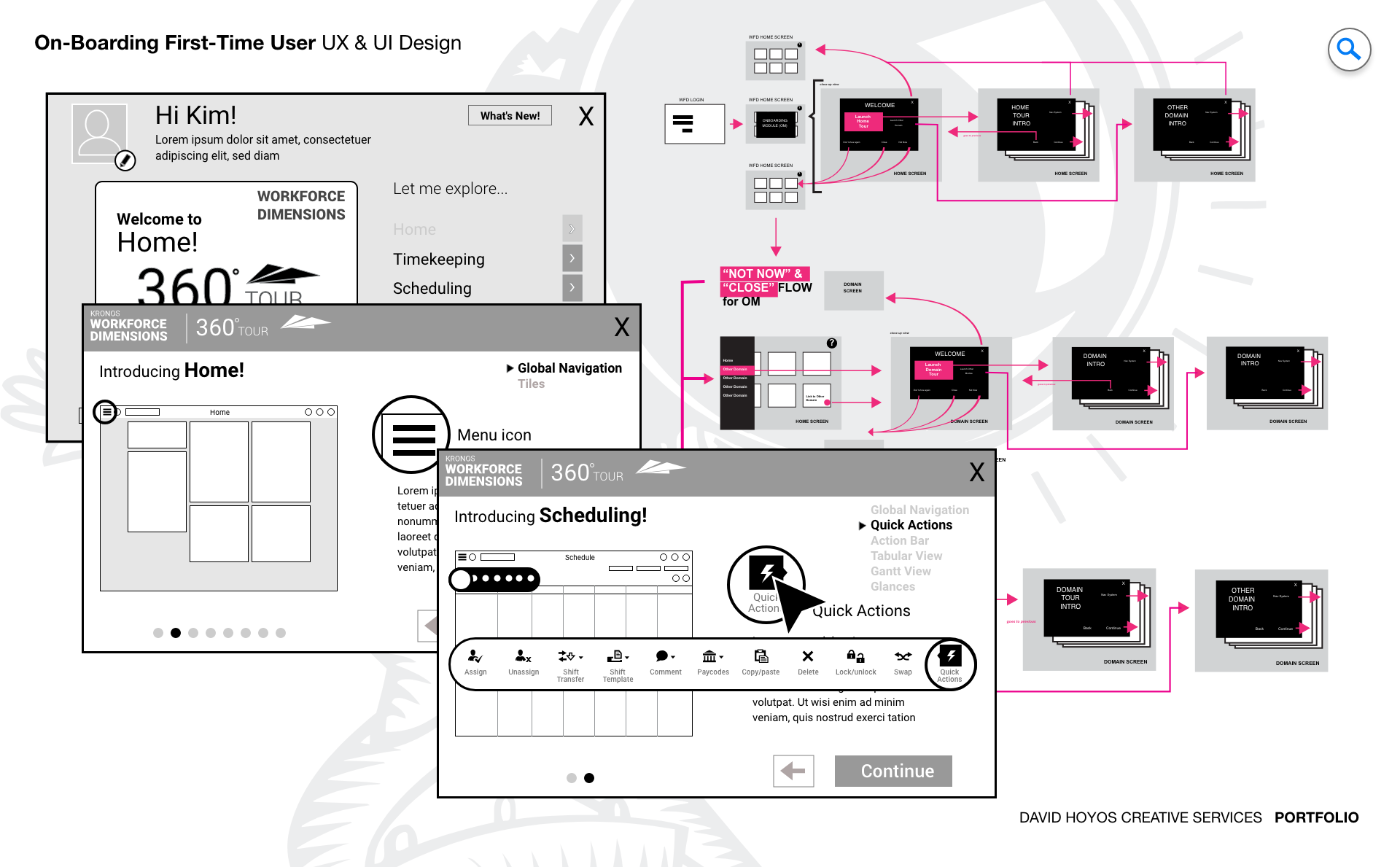
PROJECT Product On-boarding System App for First-Time Users. The first time a user opens a complex enterprise product, the product is making a wager. It is betting that what the user sees will be clear enough to orient them, engaging enough to hold their attention, and direct enough to send them toward the actions that will make the product genuinely useful to them. Most enterprise onboarding loses that wager immediately, either by overwhelming the user with a feature tour that describes everything without demonstrating anything meaningful, or by offering so little guidance that the user navigates alone through an unfamiliar system until frustration prompts them to find help somewhere else. This project was about designing an onboarding module for WFDimensions that won that wager by treating the first-time user experience as a design problem in its own right rather than a documentation task dressed up with tooltips. The module was designed as a self-contained interactive system, integrated into the web application but distinct from the product itself: a guided layer that oriented users to WFDimensions' capabilities through walkthroughs, interactive demonstrations, and contextual prompts calibrated to role and industry. The goal was not to show users everything but to show them the right things in the right order, building enough operational confidence that they could begin working productively rather than waiting until they felt they had learned enough to start. OBJECTIVE The objective was to design an onboarding experience that reduced the time between a user's first login and their first moment of genuine productivity. For an enterprise workforce management product deployed across diverse industries and user roles, that gap is a real cost. An administrator who spends their first week uncertain about how to configure the system is a week behind on delivering value to the organization. A manager who navigates onboarding and still does not know how to read the dashboard they will use every day is a manager who will rely on informal training, workarounds, or support tickets rather than the product itself. The module aimed to eliminate that gap by meeting users where they were: in their role, in their industry context, and at their level of familiarity with workforce management software. Rather than a single generic walkthrough, the onboarding system was designed to adapt its content and sequencing to the persona and context of the user receiving it, showing a manager the operational views that would define their daily workflow and showing an employee the self-service interactions that would affect their work life most directly. Sustaining that relevance over time was treated as an objective alongside the initial experience quality. An onboarding module that describes a product accurately at launch but drifts from reality as the product evolves creates confusion rather than clarity for every user who encounters it after the first update cycle. Designing for longevity meant building the content architecture of the module to accommodate change without requiring a complete rebuild every time the product it was guiding users through was updated. CHALLENGE Data density, sustainability, globalization. Data density in an onboarding context is a different problem than data density in an operational dashboard. The challenge is not displaying a large amount of data clearly but conveying a large amount of product knowledge in a sequence that is digestible rather than exhausting. WFDimensions is a complex platform. Its full feature set spans scheduling, timekeeping, analytics, task management, and compliance, and a first-time user encountering all of it simultaneously does not gain understanding. They gain overwhelm. The design had to make careful selection decisions about what to introduce when, in what depth, and with what interactive support, building a learning arc that felt natural rather than curated to the point of feeling incomplete. Sustainability introduced a structural challenge that is easy to underestimate in onboarding design. Interactive walkthroughs that reference specific UI elements, specific navigation paths, and specific product behaviors are tightly coupled to the product state at the time they were built. When the product changes, which in an actively developed enterprise platform it will, those references break. A tooltip pointing to a button that has moved, a walkthrough describing a workflow that has been restructured, or an interactive demo built against a feature that has been updated all do active harm to user confidence. Designing for sustainability meant separating the onboarding content architecture from its presentation layer in a way that allowed individual elements to be updated without requiring the full module to be rebuilt from scratch. Globalization added a third dimension that affected every structural decision the design made. WFDimensions was being deployed across multiple regions and languages, which meant the onboarding module had to function correctly in languages that expanded significantly in text length when translated from English, in layouts that needed to accommodate right-to-left reading direction, and in cultural contexts where the conventions for instructional guidance, the appropriate register of voice, and the examples used to illustrate product features all required localization rather than simple translation. Building those requirements into the design from the beginning was far less costly than adapting for them after the content architecture had been established around English-language assumptions. PERSONA(S) Manager, employee. Two personas, each arriving at WFDimensions with a different set of questions and a different definition of what a successful onboarding experience looks like. Designing a module that served both without defaulting to a one-size-fits-all walkthrough that failed both equally required building role awareness into the onboarding logic from the first interaction. Managers arrive with operational questions: how do I see my team's schedule, how do I approve a request, how do I know if coverage is adequate for tomorrow. They need the onboarding module to orient them to the views and actions that will define their daily workflow as quickly as possible, because every minute spent in a tutorial is a minute not spent managing. Employees arrive with personal questions: when is my next shift, how do I submit a time-off request, where do I see my pay period. Their relationship with the product is narrower in scope but no less important to get right, because an employee who cannot complete a basic self-service task through the product will find another way to get it done, and that workaround costs the organization the visibility it was trying to gain. INDUSTRY Retail, manufacturing, healthcare, hospitality, sales & distribution, government. Six industries meant six distinct operational contexts in which the same onboarding module had to establish relevance quickly. The features of WFDimensions that a retail manager needed to understand first were not the same as those a healthcare administrator needed to prioritize, and an onboarding experience that led with scheduling for a government user whose primary concern was compliance documentation would have started the product relationship on a misaligned note. The module was designed to adapt its content emphasis by industry context, surfacing the capabilities most operationally relevant to each vertical while maintaining a consistent structural experience that did not require building and maintaining six separate onboarding flows. The globalization challenge was particularly pronounced across this industry breadth, because the combination of regional deployment and industry-specific terminology created a localization surface that was both wide and technically specific. PROCESS Assessment + Exploration + Design Assessment began by understanding where first-time users were failing with the existing product introduction. That meant analyzing support ticket patterns to identify the questions that new users asked most frequently, reviewing session data to see where users abandoned onboarding flows or left the guided experience early, and interviewing users who had successfully ramped up to productive use to understand what had actually helped them versus what they had bypassed or forgotten. The picture that emerged informed both the content selection for the module and the interaction model that would deliver it. Exploration tested different structural models for how onboarding content could be organized and paced: progressive disclosure versus full feature tours, linear walkthroughs versus contextual prompts triggered by user behavior, role-adaptive sequencing versus a shared foundation with persona-specific extensions. Design resolved those explorations into wireframes and an interactive prototype that demonstrated the full onboarding flow across both personas and multiple industry configurations, using Sketch to develop the visual language and interaction design of the module with enough fidelity to validate the experience before any implementation work began. DELIVERABLES Wires, Prototype. Wireframes established the content architecture and interaction structure of the onboarding module before visual decisions shaped how the experience felt. The most important structural questions at this stage were about sequencing and adaptability: in what order should the module introduce product capabilities for each persona, how should the module handle a user who wanted to skip ahead or return to a previous step, and how should the content blocks be structured so that individual elements could be updated as the product evolved without disrupting the overall flow. Getting those answers right at the wireframe stage was what made the module maintainable rather than fragile. The prototype brought the onboarding experience to life in a way that static screens could not, because onboarding is fundamentally a temporal and interactive experience. A prototype demonstrated the pacing of the walkthrough, the behavior of tooltips and contextual prompts, the transitions between onboarding steps, and the logic of the role-adaptive content sequencing. Testing the prototype with real users from both persona groups validated that the module oriented them effectively and surfaced the places where the assumed sequence did not match how users naturally wanted to navigate the product for the first time. TEAM UX + UI + Research + PM The team for this project was intentionally lean, reflecting the exploratory nature of the engagement. Without engineering involved at this stage, the design work could move faster and stay focused on validating the experience model before implementation decisions constrained it. UX led the content architecture and interaction design, making the structural decisions about how the module was organized and sequenced for each persona and industry context. UI developed the visual language of the onboarding experience within the broader product design system, ensuring the module felt native to WFDimensions rather than visually distinct from the product it was introducing. Research was essential on this project in a way that went beyond usability testing. Understanding what first-time users needed to know versus what they needed to feel, the difference between informational completeness and experiential confidence, required qualitative work that shaped the content selection as much as the interaction design. Product Management connected the onboarding objectives to measurable activation metrics, ensuring the module was designed to move users toward specific behaviors that the business could track rather than toward a general sense of orientation that was difficult to evaluate. ROLE Design leadership and execution. The role combined design leadership with direct execution across both the structural and visual layers of the onboarding module. At the leadership level, that meant establishing the design principles that governed how the module handled the tension between completeness and clarity: the instinct to show everything the product could do versus the discipline to show only what a first-time user needed to start working effectively. Holding that tension consistently across a module designed for six industries and two personas required a clear point of view about what onboarding was actually for, and making that point of view explicit enough that the team could apply it to every content selection and sequencing decision. At the execution level, the role meant leading the prototype work directly, because the prototype was the primary design artifact for this project. Unlike most design work where a static high fidelity can communicate the intended experience adequately, onboarding lives in time, and its quality can only be evaluated in motion. Building the prototype with enough interactive fidelity to be tested meaningfully while keeping it light enough to be iterated quickly was both a craft challenge and a strategic one, and staying close to that work through multiple rounds of testing and refinement was where the execution contribution of the role was most concentrated.