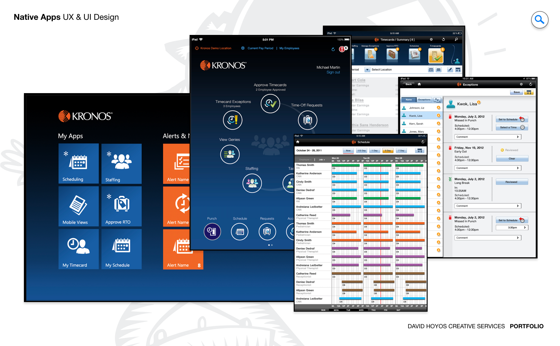
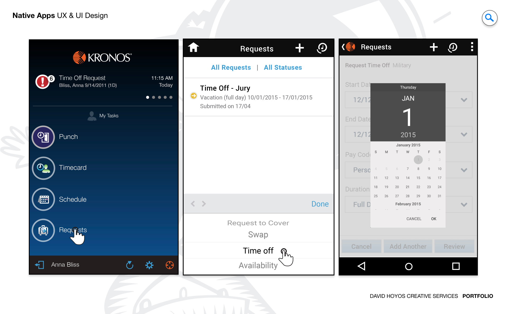
PROJECT Native App for iOS, Android, and Microsoft. Mobile was not an afterthought for this product suite. It was a genuine extension of the workforce management experience into the moments where a desktop was not available, but decisions still needed to be made. This project designed native applications across iOS, Android, and Microsoft that brought the core capabilities of the platform including scheduling, time tracking, task management, and approvals to the phones and devices that managers and employees already carried with them. The goal was to move the platform from a tool people used at a desk to a resource they could rely on from anywhere the work took them. The scope of the work reflected the breadth of that ambition. Extending a mature desktop product to mobile is not a matter of resizing screens: it requires rethinking how workflows designed for a keyboard and a large monitor translate to a thumb and a small display, without losing the power or accuracy that enterprise users depend on. The design had to earn its place on the device by being genuinely faster and easier to use in mobile contexts, not just technically functional. OBJECTIVE The objective was to design intuitive and responsive native applications that extended the core functionality of the existing product suite to managers and employees, empowering them to stay connected, informed, and productive from anywhere. For managers, that meant access to the scheduling decisions, approval queues, and team visibility that normally lived on a desktop. For employees, it meant the ability to view schedules, request time off, submit timecards, and stay informed about changes to their work without needing to find a computer to do it. The design solution had to balance usability and performance while maintaining meaningful feature parity with the web platform, ensuring that a mobile interaction did not require a follow-up desktop session to complete. That constraint shaped every design decision: features were not included on mobile because they could be, but because they delivered real value in a mobile context. The priority was always on the tasks users needed to complete on a phone, designed in a way that made completing them faster and more confident than any alternative. CHALLENGE Data density, sustainability, feature parity. Data density was the most immediate challenge. Workforce management data is inherently complex: a single schedule view might surface dozens of employees across multiple shifts, each with their own status, role, and coverage requirements. Presenting that information on a small screen without losing the relationships that make it useful required rethinking not just the layout but the hierarchy of what information a manager needed to see at a glance versus what they needed to drill into. Every pixel on a mobile screen is more expensive than on a desktop, and the design had to spend them carefully. Sustainability meant designing for a product that would grow. The native apps had to be built on a foundation that could accommodate new features without requiring a redesign every time the platform expanded. Design decisions made at the component and pattern level had lasting consequences for how efficiently the product could evolve, which meant the mobile work was as much about establishing the right system as it was about designing the right screens. Feature parity introduced the hardest tradeoff. The web platform had years of accumulated functionality, and not all of it translated cleanly to a mobile context. Deciding which features to bring, which to simplify, and which to leave for the desktop required constant alignment with product and engineering to ensure that the mobile experience felt complete without being bloated, and that it earned user trust by doing a few things very well rather than many things adequately. PERSONA(S) Manager, employee. Two personas, each with a different relationship to the platform and a different reason to reach for the mobile app instead of the desktop. Managers use the mobile app as an extension of their operational awareness. The scenarios where mobile mattered most were the ones where a manager was away from their desk but still responsible for what was happening on the floor: approving a time-off request while walking to a meeting, checking schedule coverage from a different location, or responding to an urgent staffing change without needing to find a computer. The mobile design had to surface the information and actions that were most time sensitive, in a form that could be completed in seconds rather than minutes. Employees primarily used the app for self-service interactions tied to their own schedules and time records. Checking when they work, requesting a schedule change, clocking in or out, and reviewing their timecards were the interactions that mattered most. For employees, the measure of a successful mobile experience was simple: it had to be faster and easier than calling a manager or waiting to find a terminal. If the app required more effort than the analog alternative, users would not use it. INDUSTRY Retail, manufacturing, healthcare, hospitality, sales & distribution, government. Six industries with six different mobile contexts. In retail, the app served frontline workers who rarely had access to a desktop during their shifts. Mobile was not a convenience for these users but the primary interface for anything self-service. In manufacturing and healthcare, the environments where workers spent their time were often incompatible with desktop access, making mobile essential for any interaction that happened outside of a break room or administrative area. The design had to work on devices that were checked quickly and often under less-than-ideal conditions: noisy floors, busy corridors, and dim warehouses. In hospitality and sales and distribution, mobile extended the reach of managers who were constantly moving and needed situational awareness without being tethered to an office. In government, the platform served workforces spread across facilities and field locations where mobile was the only practical way to stay connected to scheduling and time data. Across all six industries, the common thread was that mobile access was not a premium feature but a functional requirement, and the design had to treat it accordingly. PROCESS Assessment + Exploration + Design Assessment began by mapping the full feature set of the web platform against the realistic mobile use cases across the six industries the product served. Not every desktop capability belonged on a phone, and the assessment work was as much about deciding what not to bring as what to include. Interviews with managers and employees across different industries revealed which workflows were genuinely interrupted by the absence of mobile access and which were desktop tasks that no one had ever expected to do on a phone. That distinction shaped the entire scope of what the mobile apps would and would not do. Exploration tested how the core workflows translated to native mobile interaction patterns: how a schedule grid became swipeable and tappable without losing the relational information it carried at desktop scale, how an approval queue was best presented when a manager had thirty seconds rather than three minutes, and how time tracking interactions could be designed to be both fast and precise under real-world conditions. Design then translated those explorations into a native system built on platform conventions for iOS, Android, and Microsoft, producing flows that felt at home on each platform while remaining consistent in their logic and brand expression across all three. DELIVERABLES Wires, HIgh-Fidelities, BuildKit Wireframes established the structural and interaction logic for each platform before visual design entered the work. Because mobile interactions carry different constraints than desktop ones including tap targets, swipe behaviors, modal depth, and scroll contexts, the wire phase was where those constraints were resolved. Each wire specified not just the layout but the behavior: what a tap triggered, how a list paginated, how a form validated, and how the app communicated state changes back to the user. High-fidelity designs brought the system to life across the three platforms, applying the visual language of the product suite while respecting the native design conventions of iOS, Android, and Microsoft. The BuildKit gave engineering everything needed to implement the designs with precision: documented component states, spacing specifications, interaction annotations, and asset exports organized by platform. A BuildKit at this level of completeness is the difference between a design that gets built as intended and one that accumulates small implementation decisions that gradually pull the product away from the design's original intent. TEAM UX + UI + Research + App Front-end Developer + PM UX, UI, Research, an App Front-end Developer, and Product Management. The inclusion of a front-end developer in the core design team was unusual and deliberate. Native mobile development carries implementation constraints that are different from web, and having a developer in the room during design exploration meant that feasibility was a real-time conversation rather than a late-stage discovery. Ideas that would have been expensive or impossible to build were surfaced and redirected early, and the developer's knowledge of platform capabilities shaped which design directions were worth pursuing. Research kept the work grounded in real usage. Mobile design is particularly susceptible to assumptions about how users will behave on a phone, and the research function tested those assumptions against actual behavior: how users navigated the apps in the conditions that defined their workday, where they lost track of context, and which interactions were fast and satisfying versus which required more effort than they should. Those findings fed directly into design iteration and informed which parts of the system needed the most refinement before delivery. ROLE Design leadership and execution. The role combined creative direction with hands on design execution across iOS, Android, and Microsoft. At the leadership level, that meant defining the design strategy for how three native platforms would be approached: where they would follow their respective platform conventions, where they would converge on a shared interaction model, and how the visual language of the product suite would be maintained across all three without losing the native quality that makes a mobile app feel at home on its device. At the execution level, the role covered the full production scope from wireframes through high-fidelity designs to BuildKit delivery. On a project of this scope, design leadership is not separate from design execution. It means being deep enough in the work to make informed decisions about every interaction, maintaining quality across three platforms simultaneously, and ensuring that the design delivered to engineering was complete, precise, and ready to be built without ambiguity.