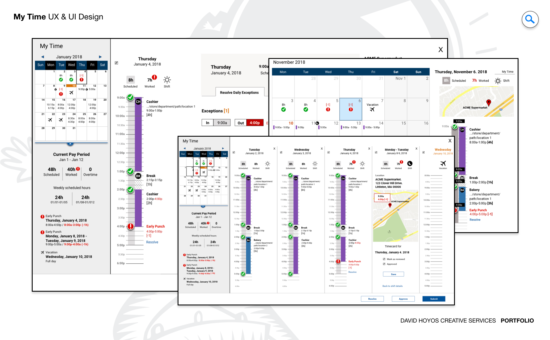
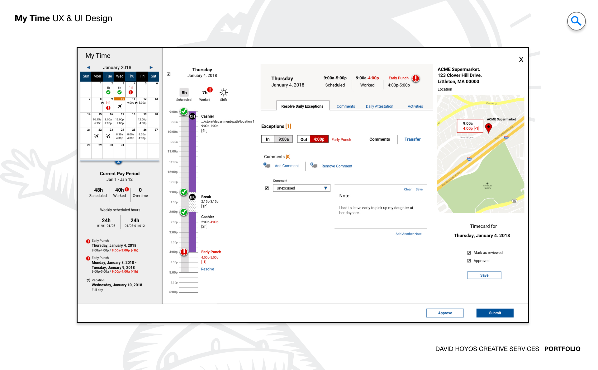
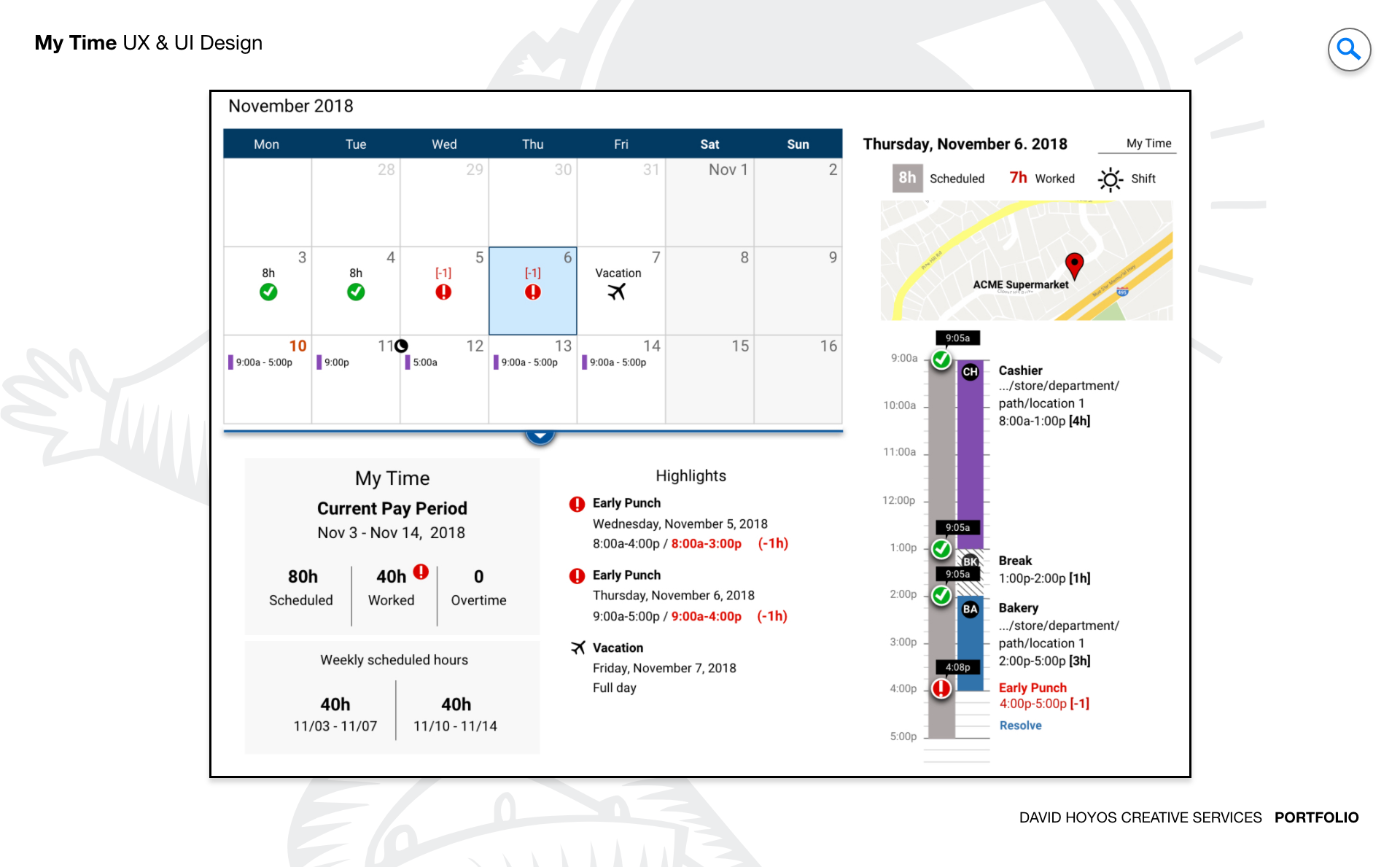
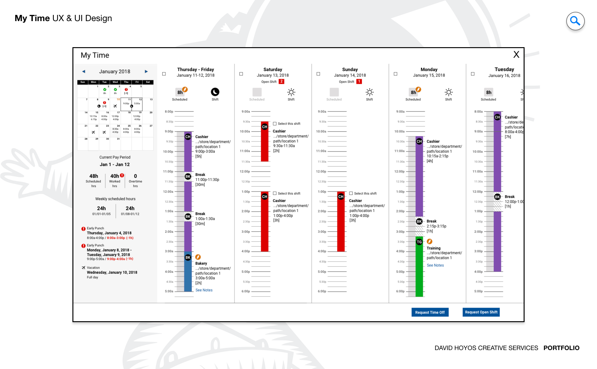
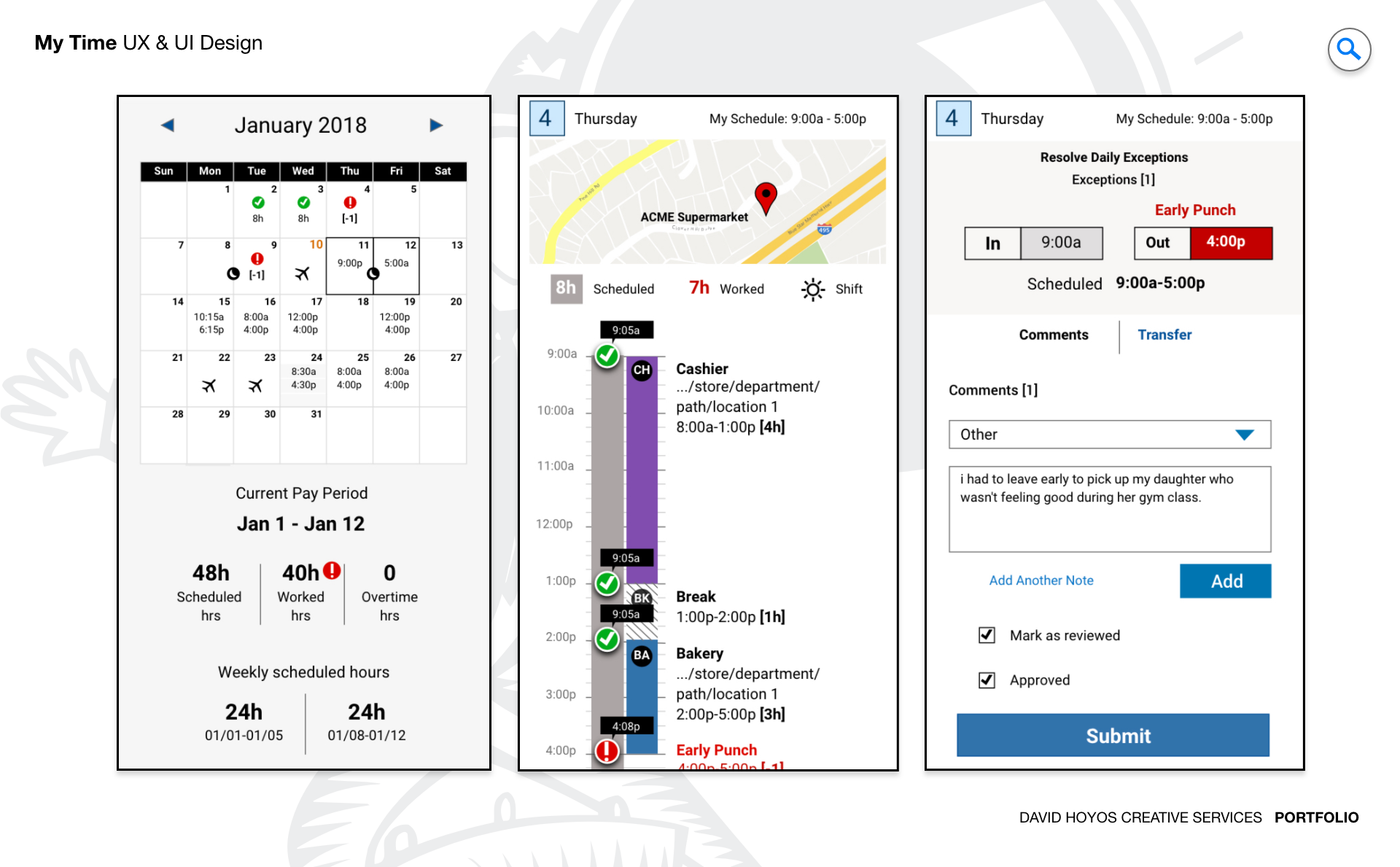
PROJECT Timekeeping and Scheduling Web/Mobile App. Hourly employees rarely have the luxury of a single device. They check a schedule on their phone before leaving home, track a shift on a shared tablet at work, and review their hours on a desktop kiosk during a break. The tools they use for each of those interactions are often different systems that do not talk to each other, which means the employee has to mentally reconcile their schedule, their tracked time, and their pay period progress across multiple surfaces with no single view that brings it all together. My Time was designed to be that view: a device agnostic experience that followed the employee across every platform without requiring them to adapt to a different interface each time. The design challenge was not just responsiveness. It was context intelligence. A phone, a tablet, and a desktop are not smaller and larger versions of the same moment. They represent different physical contexts, different amounts of available attention, and different relationships between the employee and the information they need. Designing a product that understood those differences and adapted accordingly, rather than simply reflowing content to fit a narrower column, was what separated this project from a standard cross-platform design effort. OBJECTIVE The objective was to eliminate the tool switching that hourly employees had accepted as a normal part of managing their work relationship. Schedule in one place, timekeeping in another, overtime tracking somewhere else, time-off requests through a separate workflow: the fragmentation of these interconnected pieces across multiple systems imposed a cognitive tax that fell entirely on the employee, who was the person least equipped by time and context to pay it. My Time was designed to absorb that tax by unifying all of those workflows into a single coherent experience that adapted its presentation to wherever the employee was accessing it from. Real-time feedback and predictive insight were central to the objective in a way that went beyond feature requirements. An hourly employee approaching an overtime threshold who does not know they are close until it is too late to do anything about it has been failed by the product they were supposed to use to manage their time. The design aimed to surface that kind of signal proactively, using the data the system already had to give employees the context they needed to make informed decisions about their hours before consequences became unavoidable rather than after. The visual quality of the experience was treated as a functional requirement rather than an aesthetic one. A product that employees genuinely want to open is a product they use consistently, and consistent use is what makes timekeeping data accurate. An interface that was engaging and well-crafted invited the kind of regular interaction that a utilitarian one trained users to minimize. CHALLENGE Data density, form factor. Data density in a timekeeping and scheduling product is not just about the volume of information. It is about the variety of it. A single employee's view might need to hold their current shift status, a running count of hours for the week, an overtime proximity indicator, their upcoming schedule for the next several days, their time-off balance, any pending requests, and recent pay period history. Each of those pieces is genuinely relevant to an hourly employee managing their work life. Presenting all of them in a way that felt organized rather than overwhelming required a visual hierarchy capable of communicating priority without hiding anything the employee might legitimately need. Form factor across three distinct device types added a dimension that pure mobile or pure desktop products do not face. On a desktop, the available space allows for a richer simultaneous view: schedule and timekeeping data can coexist with enough breathing room to be scanned and compared. On a tablet, the intermediate size supports a focused single-domain view with easy navigation between schedule and time contexts. On a phone, only the most immediately relevant information can lead, with the rest accessible but not competing for the primary view. Designing those three expressions of the same information model required not just responsive layout decisions but a genuine rethinking of hierarchy for each form factor, ensuring that each platform's view felt purposefully designed for that context rather than derived from another. Maintaining visual and behavioral coherence across all three platforms while honoring the differences between them was the tension the design had to hold throughout. An employee who checks their schedule on their phone and then reviews their hours on a desktop should feel like they are in the same product, oriented by the same visual language, even though the two experiences looked and behaved differently. That coherence does not happen by default. It is the result of deliberate design decisions about what stays constant across platforms and what adapts. PERSONA(S) Hourly employee. The hourly employee in this context is someone whose relationship with time is both practical and personal. Their schedule determines when they can be somewhere else. Their tracked hours determine what they get paid. Their overtime proximity affects decisions they might make about picking up or declining additional shifts. These are not abstract data points. They are the parameters of a person's working life, and the design had to treat them with the weight they carried rather than as entries in a database to be displayed. Designing for this persona across three device types also meant designing for the range of moments when each device would be used. The phone interaction often happens in a brief window of attention: on the way to work, between tasks, in a parking lot. The desktop interaction might involve more time and more focus: during a break room visit or at the end of a shift. The design had to meet the employee at each of those moments with the right level of information and the right set of available actions, without requiring them to adapt their behavior to the product's architecture each time they switched devices. INDUSTRY Retail, manufacturing, healthcare and hospitality. Across retail, manufacturing, healthcare, and hospitality, the hourly workforce shares a consistent set of timekeeping needs alongside industry-specific complications that the design had to accommodate. In retail and hospitality, irregular scheduling and variable shift lengths make the week-level view of hours particularly important because earnings are not predictable from a fixed schedule. In manufacturing, overtime thresholds intersect with union agreements and safety requirements in ways that make proactive compliance indicators more than a convenience. In healthcare, break compliance and shift duration limits are regulatory obligations, and a product that helps employees track those requirements in real time serves both their interests and the organization's accountability needs. The cross-platform requirement was equally relevant across all four industries because the device environment in each is mixed: phone in a pocket, shared tablet on a floor, desktop in a back office. PROCESS Assessment + Exploration + Design Assessment focused on how employees currently navigated between the fragmented tools they used for scheduling and timekeeping, and what that navigation cost them in time, errors, and missed information. The pattern that emerged was consistent: employees had developed personal workarounds, mental notes, and informal check-in habits that substituted for the system integrations the product should have been providing. Those workarounds were not just inconveniences to be removed. They were design signals, showing exactly what the product needed to do natively to replace behavior the employee was already motivated to perform. Exploration tested how the unified experience could be structured across the three target platforms without creating three separate design problems that had to be maintained independently. The goal was a shared information model with platform-specific expressions, and exploration was where the boundaries of that model were established: what had to be identical across all three platforms to preserve coherence, what could adapt to take advantage of each platform's strengths, and what the navigation logic looked like when an employee moved between them. Design then resolved those explorations into wireframes and high-fidelity screens for all three form factors, building the complete cross-platform experience from a single consistent design foundation. DELIVERABLES Wires, High-Fidelities. Wireframes covered all three platform expressions of the product, establishing the information hierarchy for each form factor and the navigation logic that connected them. Because the cross-platform coherence requirement made certain structural decisions non-negotiable across all three, the wireframe work involved defining those shared decisions explicitly before developing the platform-specific layouts that built on them. Without that shared foundation made explicit at the wireframe stage, the three platform designs would have drifted toward separate products that happened to share data rather than a single product that adapted to context. High fidelities realized the visual quality the project called for across all three platforms, producing finished screens that demonstrated both the context-specific adaptations and the visual language that held the experience together across them. The design work covered the full employee journey from schedule review through active shift tracking, overtime proximity indicators, break management, time-off request flows, and pay period summaries, each presented in its appropriate form for desktop, tablet, and mobile without compromising the coherence of the overall system. TEAM UX + UI + Research + Front-end Developer + Software Architect + PM A cross-platform product with a unified information model requires the team to maintain alignment on what is shared and what adapts across every design and engineering decision. UX led the information architecture and the cross-platform interaction model, making the structural decisions that determined what the employee experienced consistently regardless of device and what changed based on context. UI executed the visual design across three distinct form factors with the goal of making each feel native to its platform while remaining unmistakably part of the same product. Research ensured that the platform-specific adaptations reflected how employees actually used each device type rather than how the team assumed they did, catching several layout decisions that looked reasonable in isolation but did not hold up when tested in the actual physical contexts where each device was used. The Software Architect defined the shared data layer that made the unified experience technically feasible, and the Front End Developer translated the cross-platform design into an implementation that maintained visual and behavioral fidelity across all three surfaces. Product Management kept the scope focused on the workflows that mattered most to hourly employees, ensuring the unified experience delivered genuine value rather than feature completeness for its own sake. ROLE Design leadership and execution. The role combined design leadership with hands on execution across the full cross-platform experience. At the leadership level, that meant establishing the design principles that governed the relationship between the three platform expressions: what constituted coherence, where adaptation was appropriate, and how to evaluate whether a platform-specific decision was serving the employee's context or just making the design team's job easier. Those principles needed to be clear enough that every decision made across the wireframe and high fidelity work could be evaluated against them consistently. At the execution level, the role meant leading the design of the information hierarchy personally across all three form factors, because that was where the cross-platform coherence was built or broken. The decisions about what led the desktop view, what led the mobile view, and how the same underlying data set was prioritized differently for each context were design decisions with consequences that ran through the entire product. Staying close to those decisions through wireframes and high fidelities was what ensured the three platform expressions felt like they belonged to the same product rather than a family of related ones.