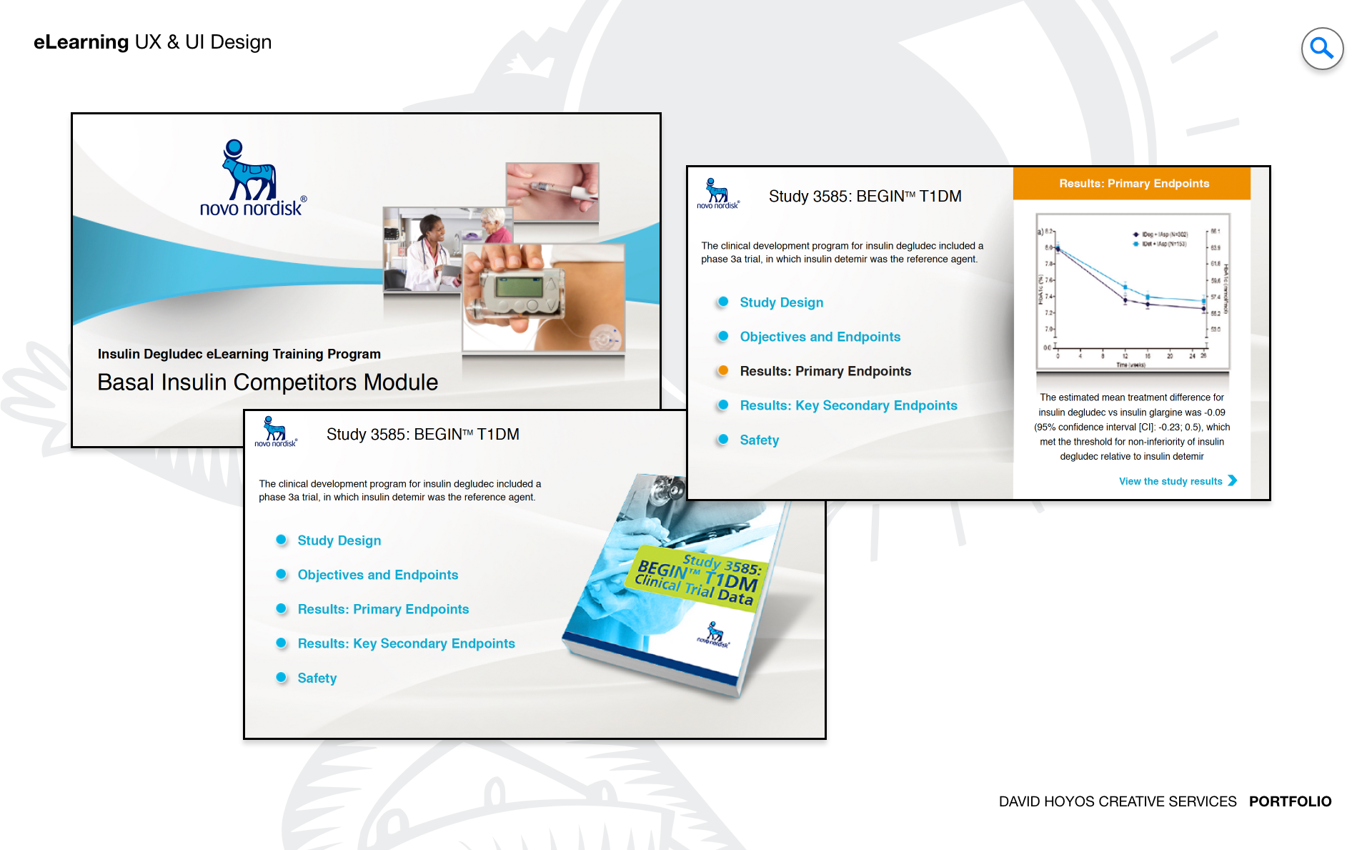
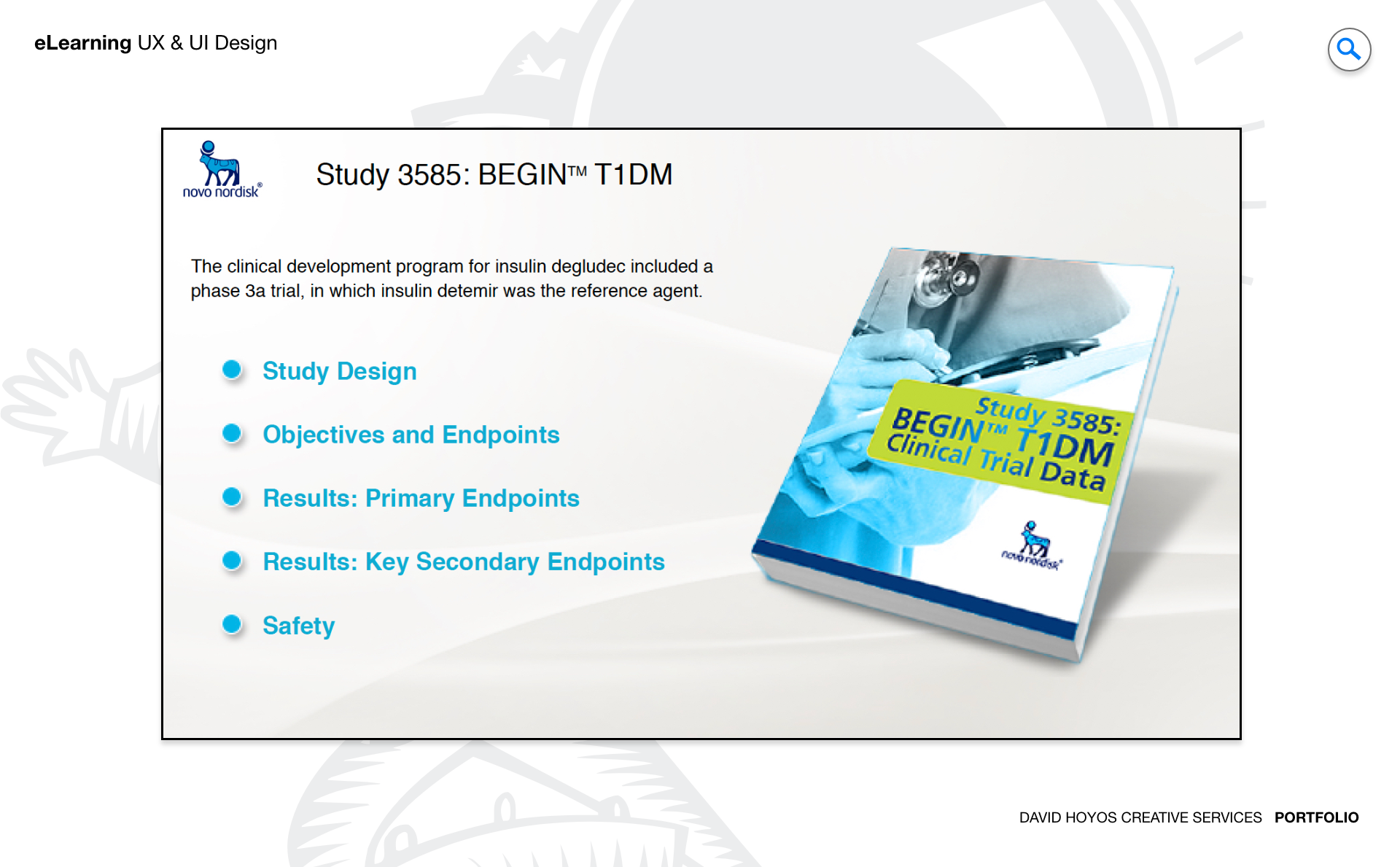
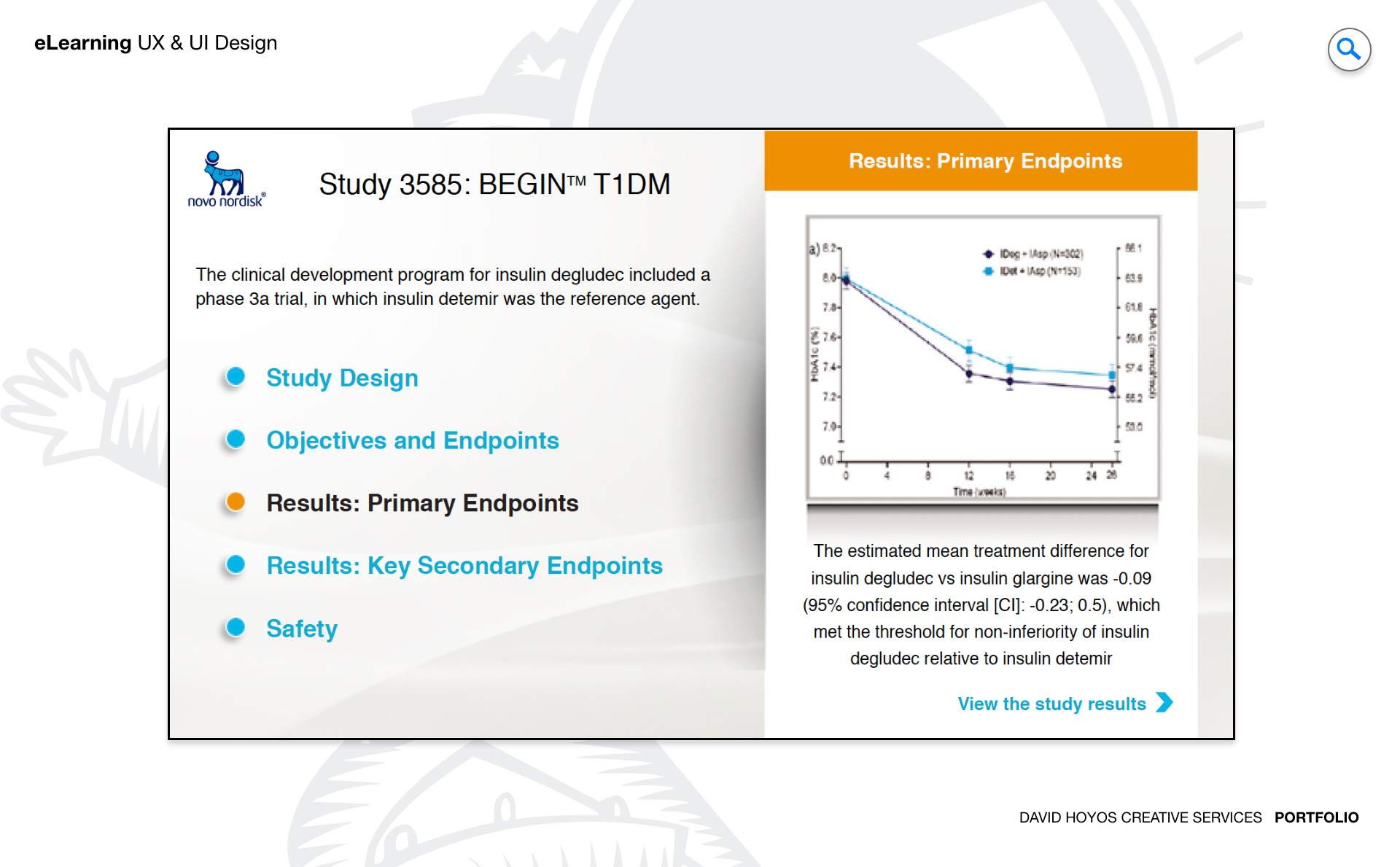
PROJECT eLearning Course for Novo Nordisk. Pharmaceutical learning carries a weight that most corporate training does not. When a healthcare professional or a Novo Nordisk team member completes a course about a treatment, a product, or a clinical protocol, the knowledge they carry out of that experience may directly inform decisions made at the point of patient care. The design of the courseware, its clarity, its structure, its ability to make complex biomedical content genuinely comprehensible rather than merely presented, is not a production quality question. It is a patient outcomes question one step removed. That is the standard Novo Nordisk's eLearning courseware was held to, and it is the standard the design team built toward across every layout template, every media asset, and every interaction decision in the course. Novo Nordisk's brand carries specific associations that the courseware had to honor at the design level: scientific rigor, a commitment to improving the lives of patients with serious chronic conditions, and a visual identity that communicated both the precision of pharmaceutical research and the humanity of its mission. A self-contained courseware that looked generic or felt disconnected from the brand would undermine the learner's confidence in the content before the first module was complete. The design team's work was to make the brand's presence in the courseware feel earned and integrated rather than applied, so the visual experience and the instructional content reinforced each other rather than operating in parallel. OBJECTIVE The objective was to design a branded, self-contained eLearning courseware for Novo Nordisk that delivered a modern, immersive instructional experience without requiring a live instructor, a connected learning management system, or any external dependency to function. Self-contained courseware placed the full burden of instruction on the design: the interface had to guide learners through the content with the same clarity a skilled instructor would provide, the layout templates had to organize complex information with the logical progression that supported genuine comprehension rather than passive consumption, and the media assets had to carry explanatory weight that supplemented the text rather than decorating it. Brand coherence across the full scope of the courseware was an objective that extended beyond applying Novo Nordisk's color palette and logo. The brand's visual identity had to be expressed in the spatial relationships of the layout templates, the tonal register of the typography, the visual style of the illustrations and graphics, and the pacing of the animations and videos. Every designed element was an opportunity to either reinforce the learner's sense that this course came from an organization of distinction and scientific seriousness, or to dilute that impression through visual choices that felt off-brand, inconsistent, or generic. The design objective was a courseware where the brand presence was total: not a skin applied over a neutral framework but a fully considered expression of Novo Nordisk's identity at every layer of the visual experience. Usability and engagement were objectives that the instructional context made inseparable. A courseware that was technically easy to navigate but visually monotonous would lose learners' active attention well before the final module. One that was visually dynamic but structurally confusing would generate anxiety rather than comprehension. The design team held both objectives simultaneously, building a navigation system simple enough to be invisible and a visual experience rich enough to sustain engagement across a course whose subject matter demanded sustained intellectual attention rather than passive receptivity. CHALLENGE Making complex pharmaceutical and biomedical content genuinely accessible without oversimplifying it was the instructional design challenge that shaped every layout template and media asset decision in the project. Novo Nordisk's subject matter, which encompassed mechanisms of disease, treatment pathways, pharmacological properties, and clinical evidence, was inherently technical. The learners who needed to understand it included healthcare professionals with substantial scientific backgrounds alongside employees and partners whose expertise lay in other domains. The design had to serve both groups simultaneously: rigorous enough that clinically trained learners found the content credible, clear enough that learners without clinical training found it comprehensible. The media assets, particularly the animations and illustrations that visualized biological mechanisms and treatment effects, were the primary design instruments for meeting that dual standard. Regulatory compliance in pharmaceutical content design added a layer of constraint with no equivalent in general corporate training. Every visual representation of a treatment's effects, every claim made through graphics or animation, and every product reference in the courseware had to align with the approved regulatory language and the clinical evidence base that governed how Novo Nordisk could communicate about its treatments. Working within those constraints while producing a media-rich, visually engaging course required close collaboration with the Instructional Designer, whose expertise in regulatory compliant content development was the guardrail that kept every creative design decision anchored in what the regulatory environment permitted. Designing compellingly within that constraint set rather than despite it was the creative challenge that distinguished pharmaceutical eLearning design from content production in less regulated environments. Designing for self-contained delivery meant the courseware could not rely on any external support mechanism to compensate for design gaps. In a live learning environment, an instructor can notice when learners are confused and respond in the moment. A connected LMS can surface progress data that reveals where learners are dropping off. A self-contained course had neither of those feedback loops available after launch, which meant the navigation logic, the content pacing, the information hierarchy within each template, and the knowledge check design all had to be right before deployment. The design team's investment in the layout template system was the response to that constraint: a set of structured, validated templates that organized content consistently and logically enough across every module that the absence of a live instructor was genuinely compensated for by the quality of the design. PERSONA(S) Healthcare Professionals and Novo Nordisk Partners Healthcare Professional: a primary learner persona whose relationship with pharmaceutical eLearning was shaped by the time pressure and knowledge density demands of clinical practice. Physicians, pharmacists, nurses, and allied health professionals who engaged with Novo Nordisk's courseware brought existing clinical knowledge to the learning experience and needed the course to build efficiently on that foundation rather than revisiting first principles. For this persona, the design's most important quality was respect for their time and their expertise: a course that moved at a pace appropriate to a trained professional, organized content in ways that matched clinical mental models, and used media assets to clarify rather than to illustrate the obvious. The instructional design and the visual design worked in concert to serve that expectation. Novo Nordisk Partner or Employee: a learner persona whose scientific background varied more widely than the healthcare professional's but whose engagement with the courseware was equally motivated. Sales representatives, medical affairs teams, patient support staff, and commercial partners needed to understand Novo Nordisk's treatments with enough depth and accuracy to represent them credibly in their professional contexts. For this persona, the media assets and the layout templates carried a higher explanatory burden: the animations that visualized disease mechanisms and treatment effects, the infographics that organized clinical evidence, and the interactive elements that reinforced key concepts were the design components that made technically demanding content accessible to learners who did not arrive with a clinical degree. Both personas shared one critical characteristic: they were engaging with the courseware independently, without a facilitator present to answer questions, clarify confusion, or adjust the pace. The design had to anticipate the moments in each module where a learner was likely to need additional context, structure those moments with supplementary content or media assets that provided it, and sequence the knowledge checks to confirm comprehension at the points where the content complexity peaked rather than uniformly at the end of each section. That anticipatory design work, informed by the Instructional Designer's expertise in learning behavior and the UX team's understanding of how learners navigated the interface, was what made the self-contained courseware genuinely instructionally effective. INDUSTRY Healthcare Healthcare is one of the most demanding environments for instructional design because the consequences of incomplete or inaccurate learning extend beyond the individual learner into the quality of care that patients receive. A healthcare professional who leaves a pharmaceutical training course with a misunderstanding of a treatment's mechanism, dosing protocol, or contraindications carries that misunderstanding into clinical decisions. The design team approached every element of the courseware with awareness of that downstream consequence, treating the clarity and accuracy of every visual representation, every instructional sequence, and every knowledge check as a clinical quality question rather than a production quality one. Novo Nordisk's position in the healthcare industry, as a global leader in diabetes care and a growing presence in obesity and rare disease treatment, placed the courseware in a specific scientific and therapeutic context that the design had to honor. The brand's identity in the healthcare market is built on decades of clinical evidence and genuine therapeutic innovation, and the courseware's visual language and instructional design needed to reflect that heritage rather than communicate as generic pharmaceutical training content. The design team's work to embed Novo Nordisk's brand identity at every layer of the courseware was ultimately a contribution to the learner's trust in what they were being taught, because in healthcare, the credibility of the source is inseparable from the credibility of the content. PROCESS Assessment + Exploration + Design + Production + Deployment. Assessment established the learning objectives, the target learner profiles, the regulatory constraints governing the content, and the brand standards the courseware had to meet, in enough detail to produce a design brief the full team could build from. The Instructional Designer's role during assessment was foundational: mapping the subject matter expertise that informed the content, identifying the learning gaps the course was designed to close, and establishing the instructional architecture that would guide learners from their starting knowledge level to the competency the course was designed to produce. The UX and UI team used that instructional architecture as the content framework within which the visual system, the layout templates, and the media asset strategy were developed. Exploration developed the visual design direction, the template system, and the media asset vocabulary before committing to full production. Layout template options were evaluated against the instructional architecture to confirm that the visual structure served the content's logical progression rather than imposing a visual rhythm that the content had to adapt to. Media asset directions were tested against the regulatory constraints and the learner profile to confirm they communicated accurately without simplifying beyond the clinical standard the healthcare professional persona required. Design, Production, and Deployment completed the cycle, with the BuildKit providing the comprehensive specification that ensured every template and asset in the final courseware was produced to a consistent quality standard, brand-compliant, and ready for self-contained deployment without further revision. DELIVERABLES Wires, High-Fidelities, BuildKit (specs). Wireframes for an eLearning courseware project served the instructional architecture as directly as they served the visual design. The wire phase established how each layout template type organized content: how the primary instructional content related to supplementary media, where knowledge checks were positioned within module flows, how navigation elements communicated the learner's location within the course and their progress toward completion, and how the self-contained experience handled states that a connected LMS would typically manage, such as completion tracking and module gating. Those structural decisions were as consequential as any visual design choice, because they determined whether the courseware's instructional architecture was actually visible to learners or hidden behind a navigation model that obscured where they were and what came next. High-fidelity designs delivered the complete Novo Nordisk-branded visual system across every template type and every media asset category in the courseware. The layout templates, graphics, illustrations, animations, and video treatments were all produced at the fidelity and resolution required for final deployment, carrying the full visual identity of Novo Nordisk's brand across every frame of the learning experience. The BuildKit provided the comprehensive production specification for the courseware: template dimension and layout rules, typographic specifications, brand color and imagery standards, animation timing and behavior guidelines, and interaction design documentation for every interactive element, giving the production team an unambiguous reference for building and extending the courseware consistently without requiring design team involvement in each production decision. TEAM UX, UI, Instructional Designer, and PM. UX, UI, an Instructional Designer, and Product Management. The Instructional Designer's presence on this team in place of the research and engineering roles that characterized other projects in the portfolio reflected the specific nature of eLearning courseware design. The primary expertise the team needed beyond visual and interaction design was not software architecture or user research in the conventional sense but expertise in how people learn, how instructional content should be sequenced and scaffolded for comprehension, how assessment should be designed to validate genuine understanding rather than recall, and how the regulatory constraints of pharmaceutical content shaped what the courseware could and could not say or show. The Instructional Designer was the expert who carried all of that knowledge and the closest collaborator to the UX and UI leads throughout the project. The UX and UI team's relationship with the Instructional Designer on this project was more integrative than the design-to-engineering relationship on software projects typically is. The instructional architecture and the visual design were not sequential phases where one handed off to the other. They were developed in parallel, with each informing the other continuously: the instructional sequencing shaping the layout template design, the visual system's constraints informing how the instructional content was structured for presentation, and the media asset strategy evolving through conversation between what the instructional approach required and what the visual direction made possible. Product Management held the Novo Nordisk brand requirements and the deployment specifications as the standards against which both the instructional and design work were evaluated throughout the project. ROLE Design leadership and execution. Design leadership and execution across UX and UI for the full scope of the Novo Nordisk eLearning courseware. At the leadership level, the role required establishing the visual design vision for a product that operated at the intersection of brand expression, instructional effectiveness, and regulatory constraint, three requirements that each pulled in different directions at specific decision points and required a clear design framework to resolve coherently. Setting that framework meant defining how Novo Nordisk's brand identity would be expressed across template types that varied in their content density and media richness, how the visual system would support the instructional architecture the Instructional Designer had established, and how the regulatory constraints would be honored without reducing the courseware's visual ambition. At the execution level, the role covered the wireframes, high-fidelity designs, and BuildKit across the full courseware scope: every layout template type, every media asset category, the complete navigation system, the knowledge check interface, and the course completion experience. The media asset design work on this project was more extensive than on standard software design projects: the illustrations, animations, and graphics that visualized pharmaceutical mechanisms and treatment effects required the same design precision and brand coherence as the interface elements, alongside the additional discipline of regulatory accuracy that distinguished healthcare content production from general instructional design. Leading that full scope of design execution, while maintaining close collaboration with the Instructional Designer throughout, was the defining responsibility of the role from assessment through deployment.