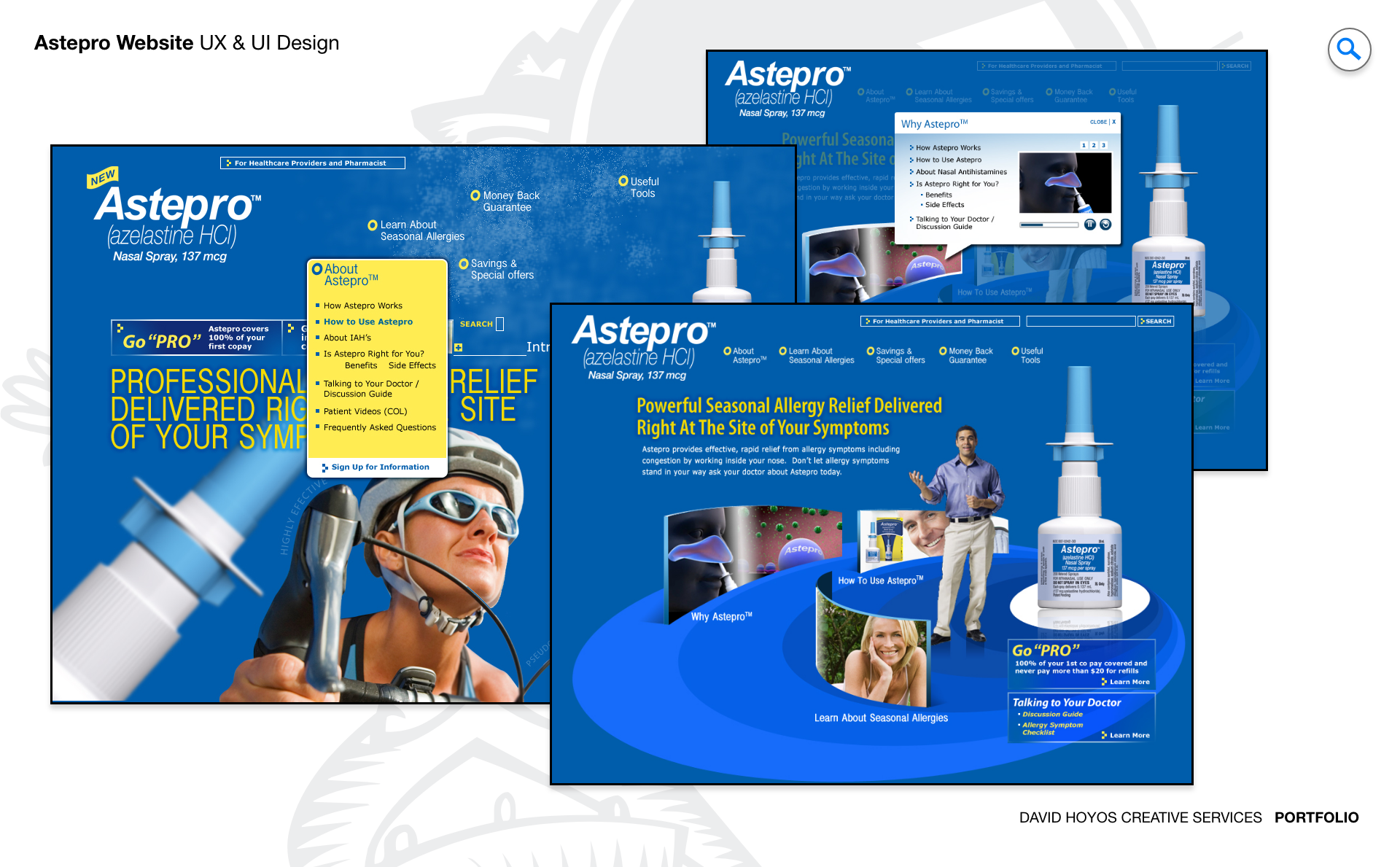
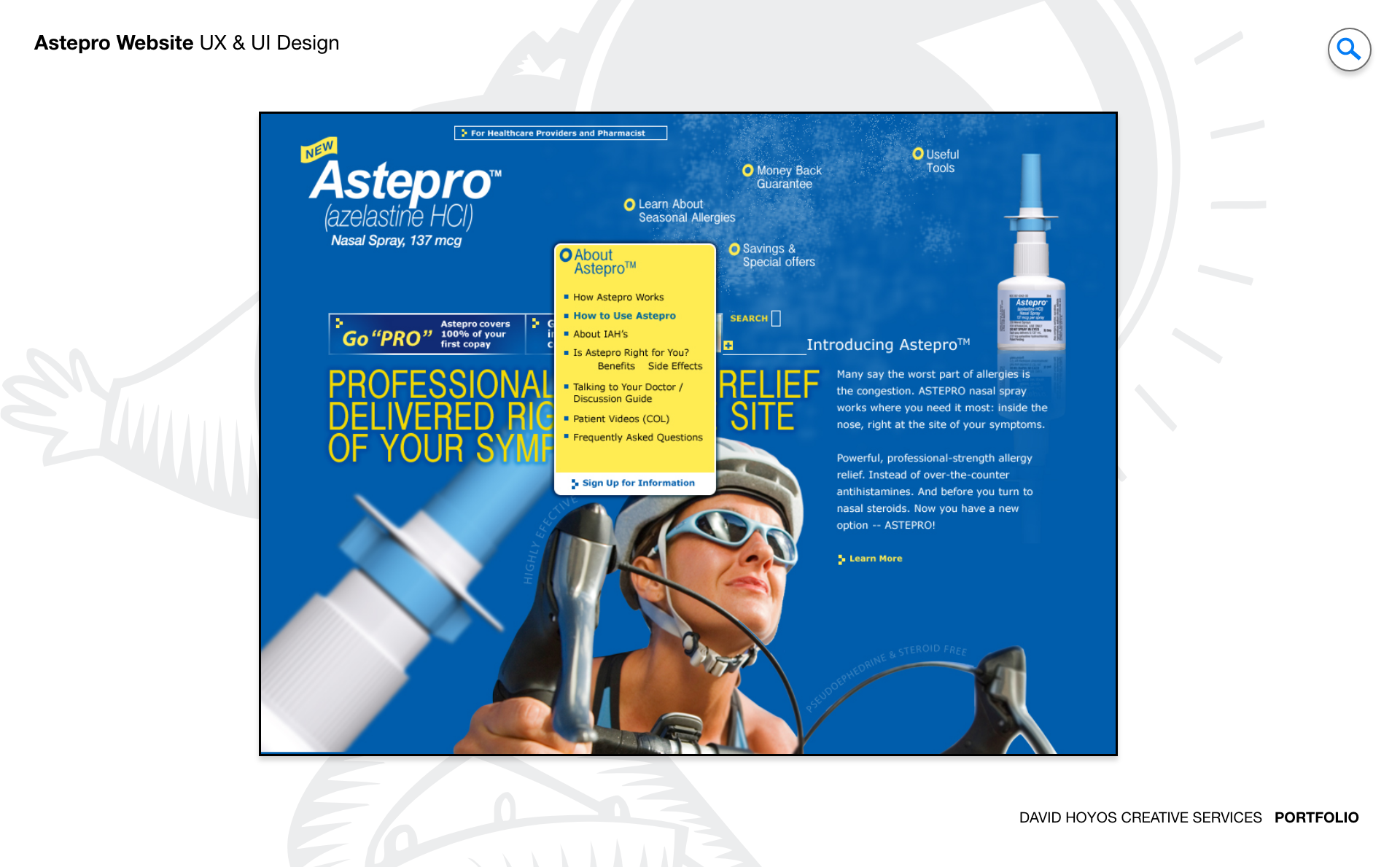
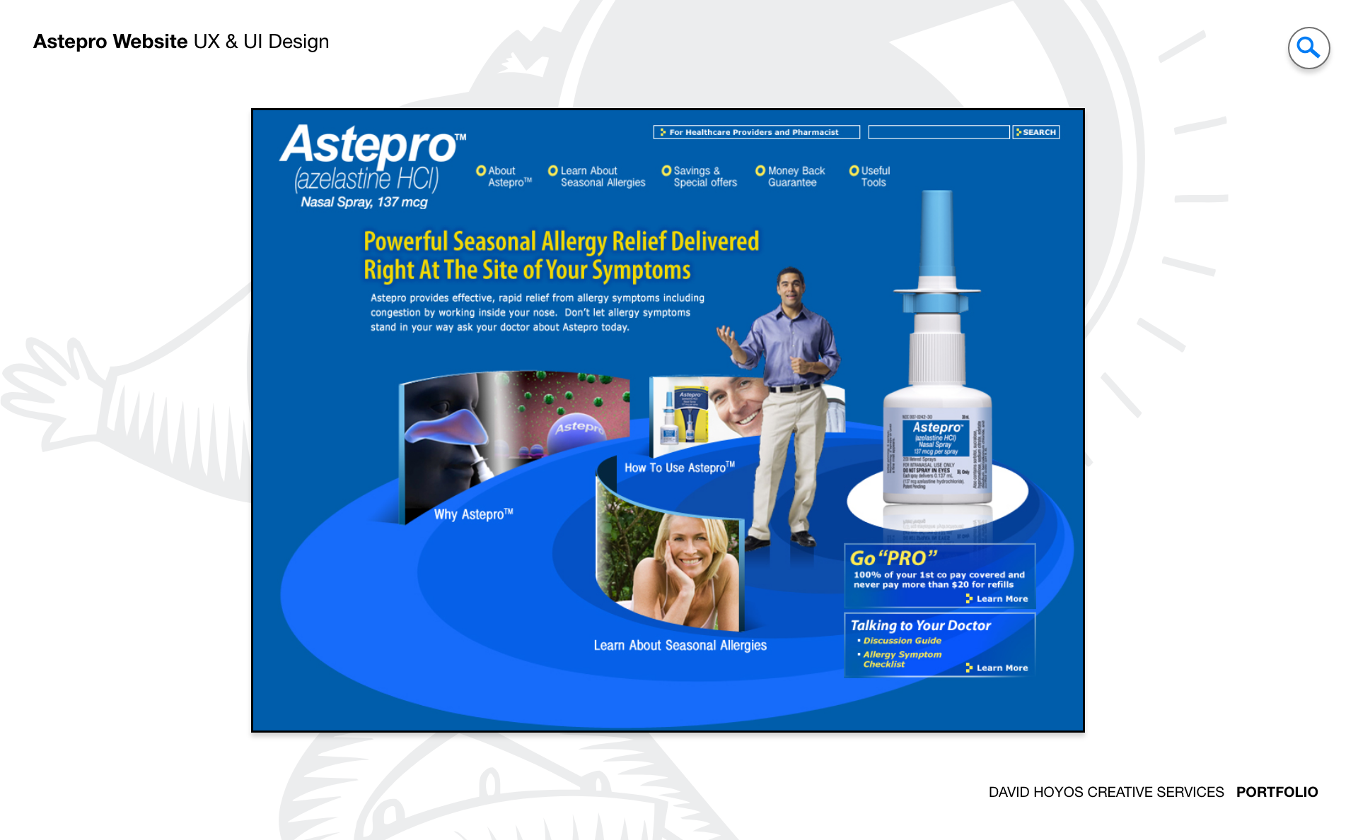
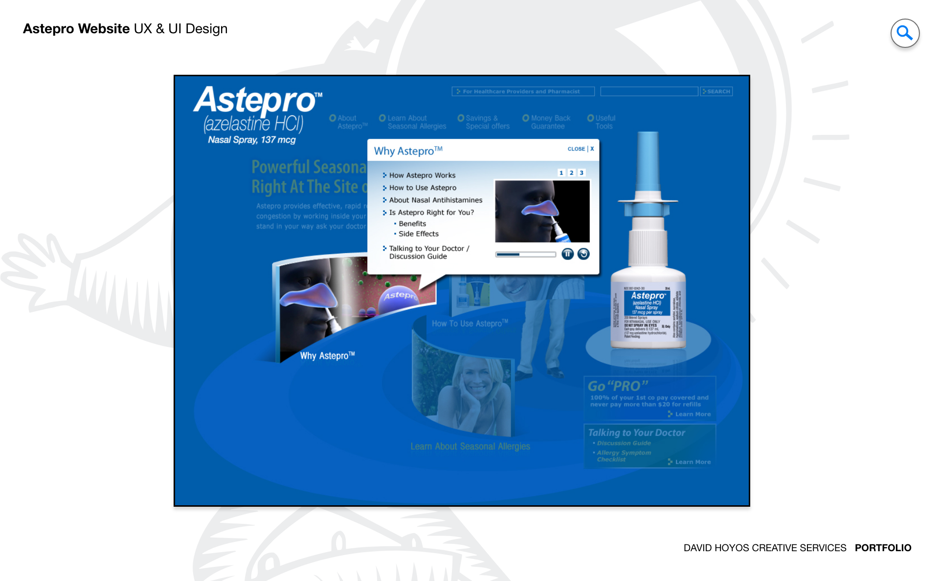
PROJECT Astepro Website (B2C). Astepro occupies a specific and well-defined space in the healthcare market: a branded nasal allergy spray with two distinct audiences that needed to find the same destination but were looking for entirely different things when they arrived. Patients wanted to understand whether the product was right for them, how to use it, and where to get it. Doctors wanted clinical information, dosage guidance, safety data, and the kind of detailed product profile that informed a prescribing decision. Designing a single website that served both audiences with equal depth and clarity, without making either feel like they had landed in the wrong place, was the central design problem the project had to solve. The website was the product's primary digital presence and its most important tool for building trust with both audiences simultaneously. In healthcare, trust is not a design aesthetic but a functional requirement. A patient who does not trust the information they are reading will not follow usage instructions; a doctor who does not trust the clinical presentation will not prescribe the medication. Every design decision in the project was evaluated against its contribution to that trust, from the color palette to the information architecture to the compliance posture the site maintained toward HIPAA and GDPR. OBJECTIVE The objective was to design a sleek, modern, fully branded website that served as the definitive digital destination for Astepro, giving patients the accessible, engaging information they needed to make confident decisions about their symptom relief options and giving doctors the detailed clinical profile they needed to evaluate the product professionally. Those two objectives had to be met from a single, coherent design rather than two separate sites, which meant the information architecture had to route each audience to the right content without requiring either to wade through material designed for the other. The visual design objective was equally specific: a website that communicated trust and professionalism while reflecting the warmth and approachability of a consumer health brand. Healthcare websites often err toward clinical severity or consumer casualness; the Astepro design had to find the register between those two modes — credible enough for a doctor to take seriously, accessible enough for a patient to feel comfortable engaging with. The responsive design requirement extended that balance across every device, ensuring that a patient checking the site on a phone during an allergy flare had the same quality of experience as a doctor reviewing the product on a desktop in a clinical setting. CHALLENGE The dual audience was the most structurally complex challenge. Doctors and patients read differently, trust different kinds of evidence, and need different levels of technical detail to arrive at confidence in a product. A patient reading about Astepro wants to know whether it will relieve their symptoms quickly and safely; a doctor reading about Astepro wants the mechanism of action, the clinical trial data, the contraindications, and the dosage information in a format compatible with their clinical workflow. Designing an information architecture that served both modes of reading from a single website required the Information Architect's involvement from the earliest phase of the project, defining the taxonomy and routing logic before a single page layout was drawn. Compliance introduced a layer of design constraint that was both non-negotiable and design-generative. HIPAA and GDPR requirements shaped not just the legal and technical infrastructure of the site but the design of every interaction that touched user data: how forms were presented, how consent was obtained, and how data practices were communicated transparently to users. Healthcare regulatory compliance in web design is often treated as a legal overlay applied after the design is complete; this project treated it as a design constraint from the beginning, which produced a site that met its obligations without feeling like it had been designed by a legal team. Accessibility added the third dimension. A healthcare website that is not accessible to users with visual impairments, motor disabilities, or cognitive differences is a healthcare website that has failed a portion of the patients it was designed to serve. In a healthcare context, accessibility carries a particular weight, because the users who most need accurate medical information are often the ones for whom accessibility barriers are highest. The design treated accessibility compliance not as a checklist but as a quality criterion that shaped decisions from information hierarchy through to interactive element behavior. PERSONA(S) Doctors and patients. Two audiences so different in their relationship to the product that designing for both in a single experience required treating each as a first-class citizen of the information architecture rather than prioritizing one and accommodating the other. Patients arrive at the Astepro website with a symptom and a question. They want to know whether this product can help them, whether it is safe, how to use it, and where to get it. Their relationship to the medical information on the site is personal and emotionally engaged: they are making a decision about their own health, and the design had to meet that engagement with clarity, warmth, and the kind of evidence-based reassurance that healthcare decisions require. The patient journey through the site was designed to move from symptom identification through product understanding to confident action, with no point in that journey requiring clinical literacy to navigate. Doctors arrive with a professional framework that filters everything they read through clinical criteria. They are evaluating Astepro against other treatment options in their prescribing toolkit, and the information they need to complete that evaluation is specific: efficacy data, safety profile, dosage recommendations, contraindications, and the references that allow them to verify the claims being made. The website's information architecture created a distinct pathway for this audience, surfacing the clinical depth they required without making patients wade through material that was not relevant to their decision-making process. INDUSTRY Healthcare Consumer health, specifically — the segment where a branded medication is marketed directly to patients while also requiring clinical adoption by physicians. Consumer health sits at the intersection of pharmaceutical regulation and consumer marketing, and that intersection creates a design environment with constraints that do not exist in most other product categories. Every claim the website made about Astepro had to be defensible against regulatory scrutiny; every piece of safety information had to be present and accessible, not buried in footnotes designed to minimize its visibility. Designing within those constraints while still producing a website that felt engaging and welcoming to a consumer audience required a careful balance between the legal precision of pharmaceutical communication and the accessibility of consumer-grade design. The healthcare context also shaped the trust hierarchy the website had to establish. Patients are increasingly conducting product research before they see a doctor, and the information they find during that research shapes the conversation they have in the clinical setting. A well-designed Astepro website was not just a marketing asset but a patient education tool that could improve the quality of those clinical conversations, ensuring that patients arrived at their appointments with accurate, well-organized information rather than misinformation from less reliable sources. PROCESS Assessment + Exploration + Design + Production + Deployment. Assessment began with an audit of the competitive landscape in the consumer nasal allergy category and a study of how both patients and doctors were currently seeking information about allergy relief products online. The research revealed significant variation in how healthcare product websites served these two audiences: most sites optimized for one at the expense of the other, creating a fragmented experience where either the clinical depth was present but inaccessible to consumers, or the consumer accessibility was present but the clinical detail was insufficient for physician evaluation. That gap defined the information architecture challenge that shaped the rest of the project. Exploration tested the range of possible information architecture approaches for a dual-audience healthcare website, with the Information Architect playing a central role in defining the taxonomy, the navigation model, and the content structure that would route each audience effectively. Responsive design requirements were integrated into the exploration phase rather than added at the end, ensuring that layout and navigation decisions were validated across device sizes before being committed to production. Design, Production, and Deployment completed the full cycle, with HIPAA, GDPR, and accessibility compliance integrated throughout rather than applied as a retrofit at the end. DELIVERABLES Wires, High-Fidelities, BuildKit (specs). Wireframes for a dual-audience B2C healthcare website at this scope required working through the full information architecture before any visual decisions were made. The wire phase established the navigation model, the content hierarchy within each major section, the patient and doctor pathway logic, and the responsive layout rules across desktop, tablet, and mobile. The Information Architect's involvement made the wire phase more rigorous than a standard UX-led process: the structural decisions were validated against the content taxonomy before they were drawn, which prevented the common problem of wires that looked structurally sensible but could not accommodate the actual content they were meant to organize. High-fidelity designs translated the structural decisions into the full Astepro visual identity: the brand color palette, the typographic system, the high-quality product imagery, and the interactive elements including videos, animated graphics, and product demonstrations. The BuildKit delivered the complete implementation specification for the front-end developer: every component state, every responsive breakpoint behavior, every animation specification, every accessibility annotation, and the compliance implementation details for the HIPAA and GDPR requirements, organized to give the development team everything needed to build the website as designed and validated. TEAM UX + UI + Research + Front-end Developer + Information Architect + PM UX, UI, Research, a Front-end Developer, an Information Architect, and Product Management. The inclusion of an Information Architect was the most distinctive aspect of the team structure, and it reflected the complexity of the dual-audience content challenge the project faced. Information architecture on a consumer healthcare website is not a task that UX design absorbs without cost: the taxonomy, the navigation model, the content relationships, and the regulatory compliance requirements of a pharmaceutical product website are each complex enough to warrant dedicated expertise. Having an Information Architect who owned those decisions from the beginning produced a site structure that was coherent in ways it would not have been if those decisions had been made incrementally by the design team. Research served a dual function: it grounded the patient experience in real consumer behavior and the doctor experience in real clinical information-seeking patterns. Those are different research disciplines, and the findings from each shaped different aspects of the design. The front-end developer's involvement in design exploration ensured that the interactive elements and responsive behaviors the design proposed were technically feasible, and that the accessibility and compliance implementation would not require the design to be revised after engineering had begun. ROLE Design leadership and execution. Design leadership and execution across UX and UI for the full scope of the Astepro website. At the leadership level, that meant setting the design vision for a product that had to satisfy requirements from multiple directions simultaneously: the brand's visual identity standards, the regulatory constraints of pharmaceutical marketing, the accessibility requirements of a public-facing healthcare product, and the usability needs of two audiences with very different relationships to the information. Holding all of those requirements in a coherent design vision required a clear hierarchy of priorities that the team could apply consistently across a large and varied content set. At the execution level, the role covered the wireframes, high-fidelity designs, and BuildKit across a website with significant scope: a homepage designed to capture attention and route users, multiple content sections with different informational purposes and different audience targets, a fully responsive layout system, and a complete set of interactive elements. Maintaining quality across that full scope while respecting the regulatory and compliance constraints that shaped every content and design decision was the execution challenge that defined the role on this project.