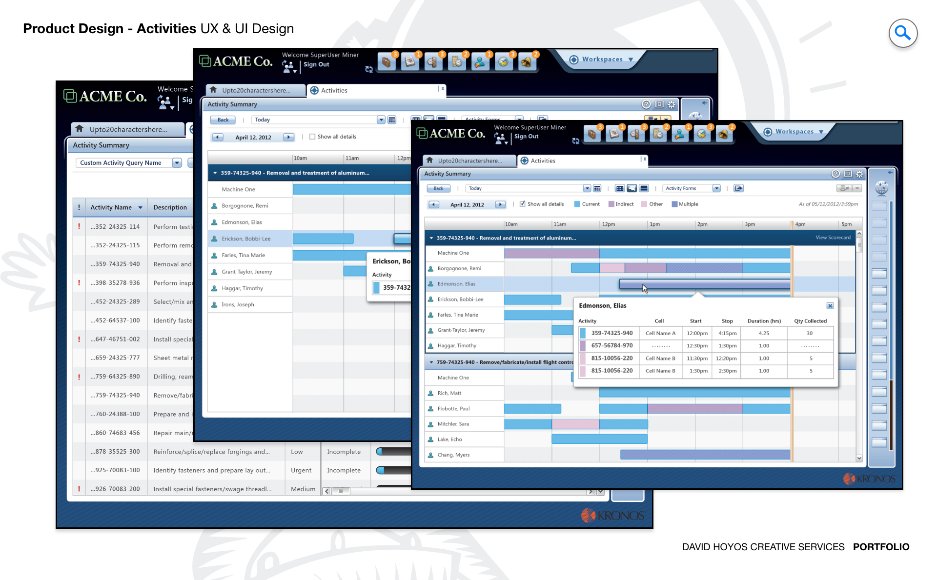
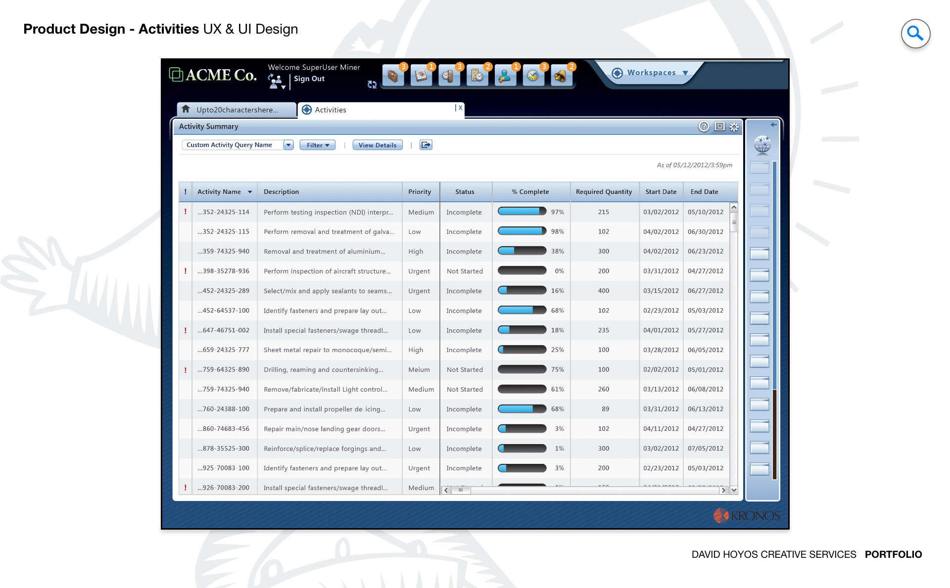
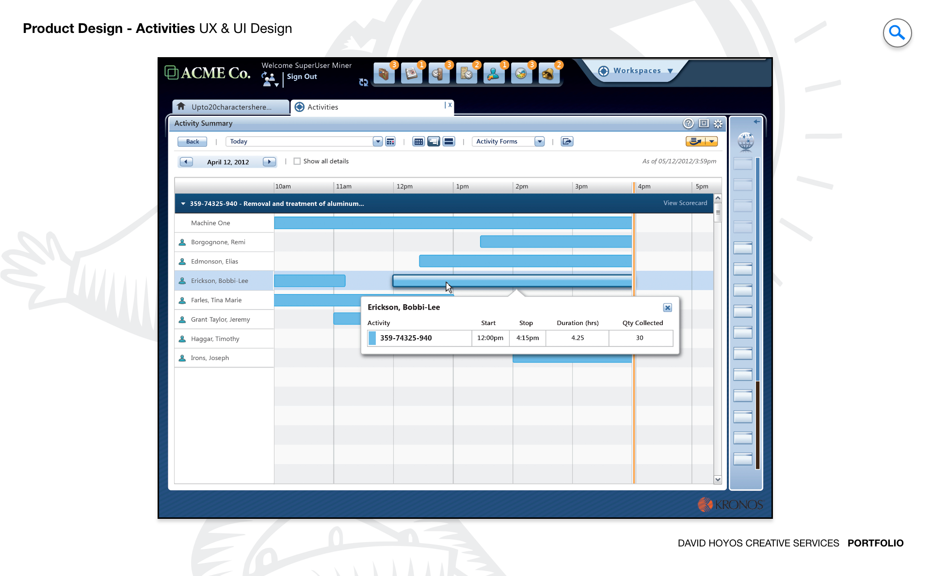
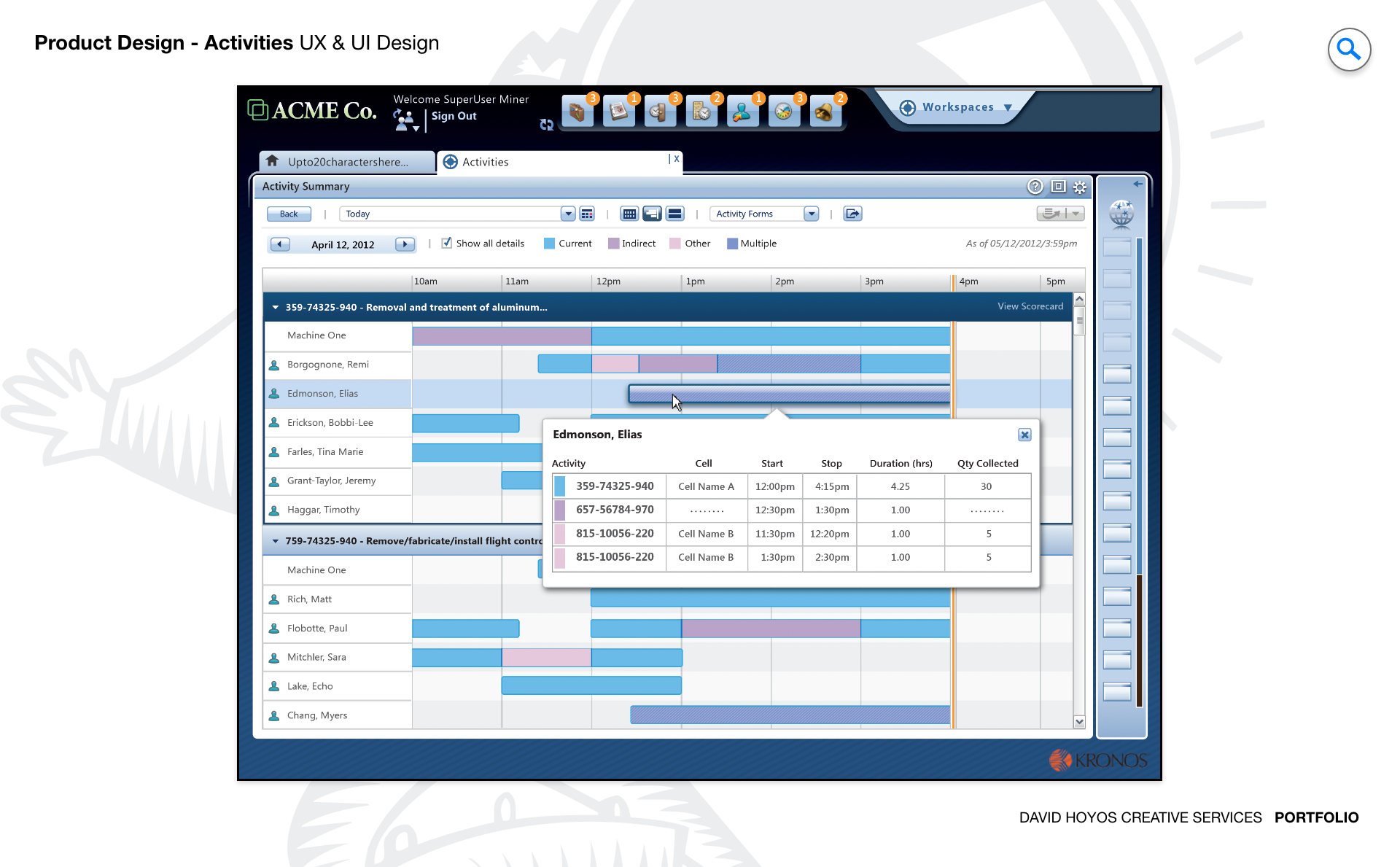
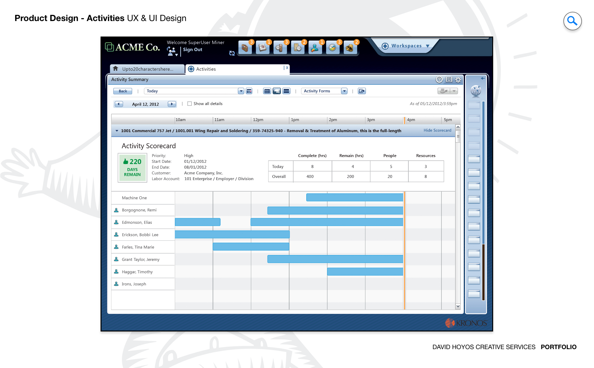
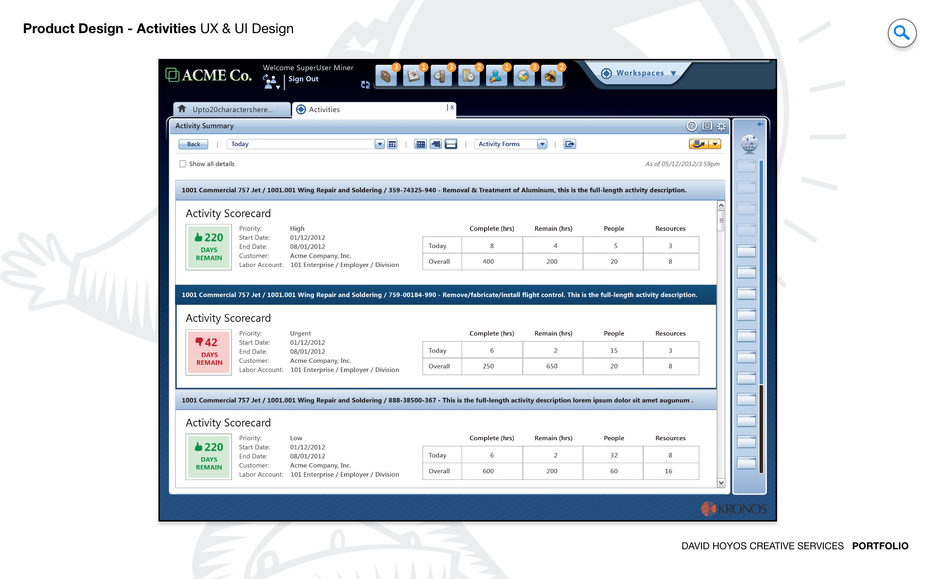
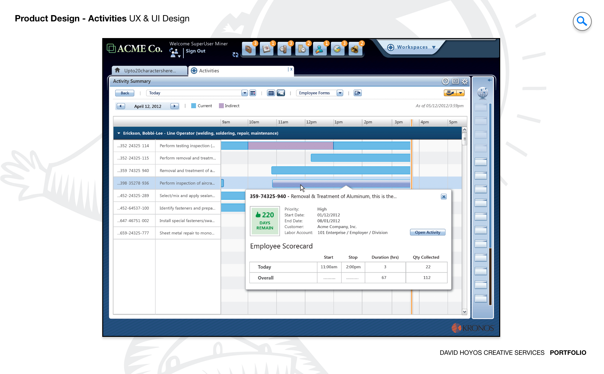
PROJECT Activities Web App. Manufacturing operations run on task execution. At any given moment, a production manager is responsible for dozens of concurrent activities spanning multiple teams and production lines, each with its own assignee, deadline, priority level, and dependency on upstream work. The tools most managers use to track all of this sit somewhere between a whiteboard and a spreadsheet, which means the real state of operations at any moment is partially visible at best and carried in someone's head at worst. This project was about replacing that fragile system with a purpose-built web application designed around how manufacturing managers actually think about and coordinate work. The goal was not just to digitize task tracking but to make the operational picture legible at scale. A manager overseeing fifty concurrent tasks across four production lines does not need a longer list. They need a system that surfaces what requires attention, communicates accountability clearly, and gives them the controls to act without leaving the view they are already in. OBJECTIVE The objective was to design a task management platform that reduced the cognitive overhead of running a manufacturing floor by making planning, delegation, and monitoring feel like a single continuous workflow rather than three separate administrative activities. Managers in high volume production environments spend a significant portion of their time doing coordination work that should be handled by the system: following up on overdue tasks, redistributing work when someone is absent, identifying which blocked activities are creating downstream delays. The platform was designed to absorb that overhead, surfacing the decisions that required human judgment while handling the tracking and status communication automatically. Real time visibility was a central requirement, not a feature. In manufacturing, a task that is behind schedule by two hours can mean a production line that stops for a shift, which carries immediate and measurable financial consequences. The design had to make status information available at the granularity managers needed to act before a delay became a disruption, with smart prioritization that distinguished between tasks that were late and tasks that were late and critical. Scalability shaped the design from the beginning. A platform that works well for a single team and falls apart when it spans a full facility is not a solution, it is a prototype. The system needed to handle task volume, team complexity, and operational variation without requiring managers to change how they worked as their scope grew. CHALLENGE Vertical real-state, data density. Vertical real estate is the defining constraint of task management interfaces. Unlike a schedule grid, which distributes time horizontally and can be navigated left and right, a task list grows downward. In a manufacturing context with dozens of concurrent activities, that means the most important tasks compete for the same visible space as routine ones, and the manager's ability to stay oriented within the full picture depends entirely on how well the design manages that vertical dimension. Scrolling through an undifferentiated list to find a critical overdue item is not a design solution. It is a design failure. Data density compounds the vertical problem. Each task in a manufacturing environment carries multiple meaningful attributes: the assigned team member, the production line it belongs to, its current status, its deadline, its priority level, and its relationship to other tasks that depend on it or that it depends on. Displaying all of those attributes for every task simultaneously produces a grid so dense that users learn to read it selectively, which means they are regularly missing information the system technically contains. The design challenge was not reducing the data but creating a visual hierarchy within it that made the most operationally significant attributes immediately readable and the supporting detail accessible without scrolling or clicking away from the primary view. PERSONA(S) Manager A single persona, but one operating under conditions that test the limits of any task management system. The manufacturing manager in this context is not managing a small team with a shared backlog. They are responsible for coordinating work across multiple production lines, each with its own workforce, its own task cadence, and its own set of dependencies on materials, equipment, and upstream processes. Their attention is continuously distributed, their context switches are frequent, and the cost of a missed or misunderstood task is not a delayed feature but a stalled production run. Designing for this persona meant designing for someone who cannot afford to spend time navigating the product. The interface had to support the manager's natural scanning behavior, the way an experienced production manager walks a floor and reads the state of operations in seconds, translating that spatial and intuitive awareness into a digital interface that was equally fast to read and equally fast to act on. Every interaction design decision was evaluated against that standard: does this let the manager stay oriented and stay moving, or does it pull them out of the operational flow to manage the tool instead of the work? INDUSTRY Manufacturing Manufacturing is an industry where operational visibility is not a management preference but a production requirement. The relationship between task status and business outcome is direct and measurable: a delayed maintenance activity can take a line offline, an unassigned quality check can hold a shipment, and a communication gap between shifts can compound errors across multiple work orders before anyone realizes the source. The design had to reflect that stakes environment, treating real time status accuracy and clear accountability as structural requirements rather than dashboard enhancements. At the same time, manufacturing environments vary significantly in how work is organized, from discrete assembly operations to continuous process production, and the platform needed to be configurable enough to serve that variation without requiring custom implementations for each operational model. PROCESS Assessment + Exploration + Design + Production + Deployment. Assessment revealed that the core problem was not a missing feature but a missing model. Managers were using generic tools in ways those tools were never designed to support: color coded spreadsheet rows standing in for priority levels, chat threads serving as task status updates, and individual memory filling the gaps that the system left open. The assessment phase made those workarounds visible and used them as a map of what the product needed to do natively. Exploration tested structural alternatives before committing to any single approach, examining how different ways of organizing and displaying tasks affected how quickly managers could orient themselves and identify what needed attention. Design, production, and deployment followed the same structured cadence used across the broader platform, with close collaboration between design and engineering to ensure that the real time data requirements and the task relationship logic were reflected in both the interface and the underlying architecture throughout the build rather than reconciled after the fact. DELIVERABLES Wires, High-Fidelities, BuildKit (specs). Wireframes resolved the structural and organizational questions that the density of manufacturing task data made unavoidable before any visual work could begin: how tasks are grouped and filtered, how priority and status are encoded in the layout rather than added as separate columns, how the relationship between a task and its dependencies is communicated without requiring a separate diagram view, and how the interface handles the transition between a high level operational overview and the detail of a single task without losing the manager's place in the broader picture. High fidelities established the visual language for a data dense professional interface where clarity and speed of reading mattered more than aesthetic novelty. BuildKit packaged the complete specification for engineering, covering task state logic, real time update behavior, priority and status display rules, filter and sort interactions, and all component level documentation needed to build the system accurately and maintain design coherence as new task types and workflow configurations were added over time. TEAM UX + UI + Research + Front-end Developer + Software Architect + PM Task management in a manufacturing context sits at the intersection of operational process design and product design, and the team needed to bridge both. UX led the information architecture and interaction model, making the structural decisions about how tasks were organized, how status was communicated, and how the manager's workflow moved from overview to action to resolution. UI executed the visual design for an interface where density was unavoidable and the quality of the visual hierarchy determined whether the product was usable or merely functional. Research grounded the design in real manufacturing management behavior, ensuring that the task organization model reflected how experienced production managers actually categorized and prioritized work rather than how a generic task management framework assumed they did. The Software Architect defined the real time data model that made live status updates possible at scale, and the Front-End Developer kept the interface performant as task volume and team complexity grew. Product Management connected design decisions to the operational outcomes that mattered to the business, ensuring the product measured its success in production efficiency rather than feature delivery. ROLE Creative and design direction (UX/UI). The role combined creative direction with hands on UX and UI execution across the full product experience. Creative direction here meant establishing a clear design philosophy for how the platform would handle the tension between completeness and clarity: a task management system that shows everything is as unusable as one that shows too little, and finding the right balance required setting a standard for information hierarchy that held consistently across every view and every task type the system supported. On the UX side, the role meant leading the interaction model for the core task views directly, because those were the surfaces where the design's value would be won or lost. On the UI side, it meant making the visual decisions that allowed data density to coexist with readability, using spatial organization, typographic hierarchy, and status encoding to produce an interface that communicated the state of a complex operation at a glance without asking the manager to decode it first.